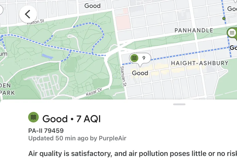
The Google Maps app on IOS and Android has added a new air quality layer, which will be very useful when planning the next hike or bike ride, or when planning to escape from haze and smoke. The new layer directly displays the air quality index (AQI) on the map grid, and uses government data collected from agencies such as the US Environmental Protection Agency to display the overall health of the air.

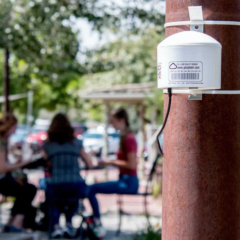
More precisely, it also shows the data collected from purpleair's sensor network to report fine-grained conditions from the street level. Click the air quality index reading dotted on Google maps to provide more information about the impact of air quality on health, the time and source of the last reading, and links to learn more.
Purpleair's relatively low-cost sensor uses a laser particle counter to measure particles. "Irradiate the air with a laser, and the particles in the air will reflect light, and the detector will capture these reflections." Adrian dybwad, the founder of purpleair, explained that his company's sensors became a popular way to track the smoke from the devastating wildfires raging on the west coast. Last year, Google Maps added a layer of wildfires to track the growing threat.

In addition to purpleair, breezemeter is also working on mapping ultra local air quality. The breeze uses complex models -- not physical sensors -- to achieve the claimed 5-meter (16 foot) data resolution. Since the beginning of last year, many E-bike owners have relied on the company's data to avoid pollution during their commuting.