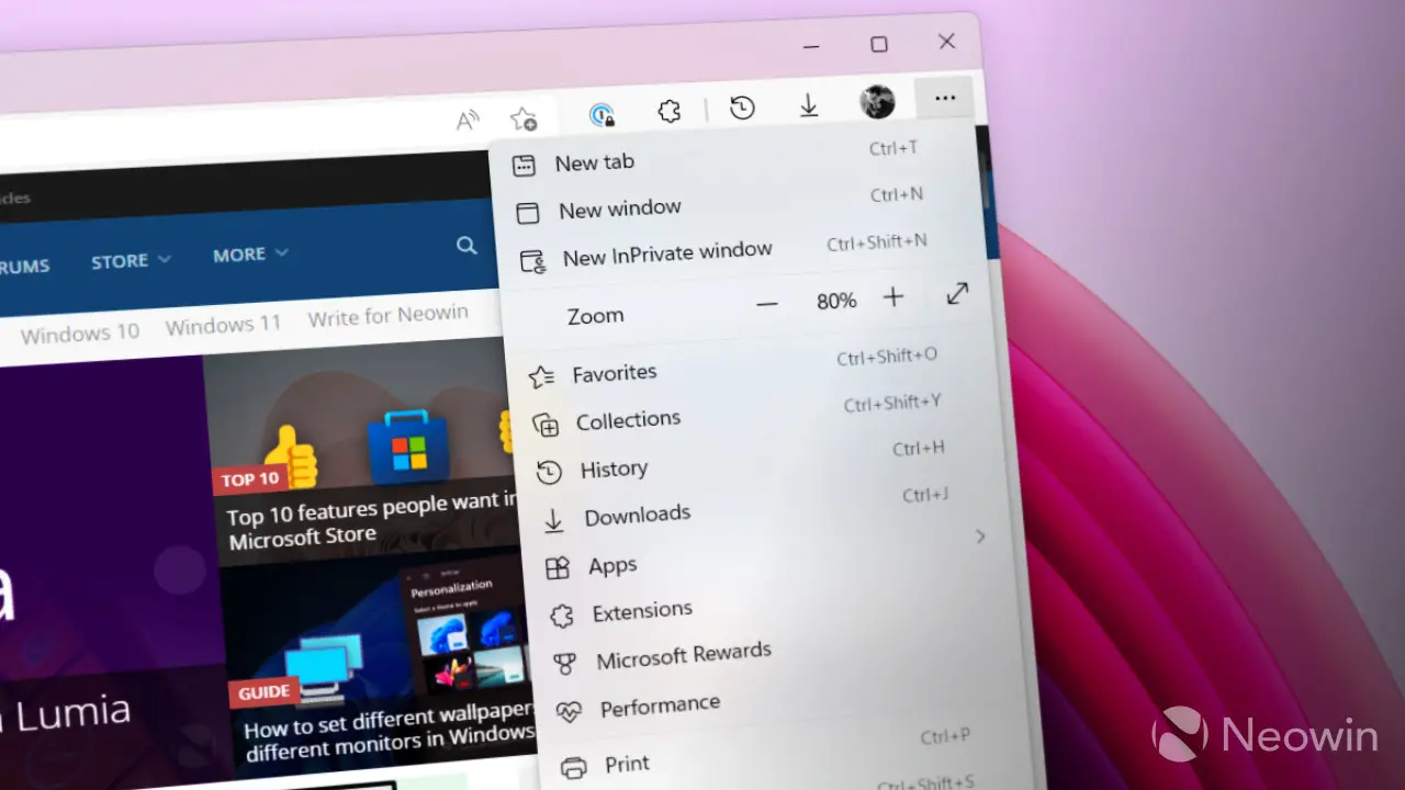
A few days ago, on the tech community forum, Microsoft released the monthly top feedback summary on edge. It contains questions and suggestions with the most feedback from users and Microsoft's plans to solve these problems.

Through these monthly summaries, users who use edge can easily know whether their feedback has been accepted by Microsoft and the improvement progress of Microsoft. In this month's post, the most noteworthy ones include the annoying large right-click menu, downloading "shelf" and so on.
Right click menu
Many edge users think the browser's right-click menu has become too large. On some devices, the right-click menu is no longer suitable for the screen. Here are Microsoft's views on this issue:
We heard about right clicking content and Menus are too long, too wide, and do not provide any customization. You may have seen some ways we try to solve these pain points in the Canary channel.
It may take some time for the promised "try" to appear on the Canary channel, let alone the stable version. However, I am glad to know that Microsoft has not turned a deaf ear to user feedback.
Download shelf
Another thing customers want from Microsoft is the old-fashioned download rack that appears at the bottom of the screen when downloading files. According to Microsoft, the idea has changed from "under review" to "alternative planned", which means that future updates will provide an alternative view for the current download UI.
Interestingly, despite the intense feedback from users, Google Chrome also achieved a similar experience to the download UI of Microsoft edge.
Here are other ideas that Microsoft is considering implementing to address general user feedback (no specific time frame):
● double click the close tab
● a better way to turn off vertical labels
● option to move vertical labels to the right
● better tools for managing automatic audio and video playback
● always open favorites in new tabs
● search in the collection
● respect the default PDF viewer