We can't talk about Apple without talking about the Macintosh. The high price of $2,495 at launch and its lackluster sales make it one of those products that should be classified as a failure today.
But over time, in today's perspective, it's a necessary part of Apple's storied history, a pivotal point in the history of technology, an iconic symbol of retro and 80s, a code word for when Geeks meets gamers, a timeless talking point in the tech press, and a golden item for digital gamers' nostalgia.
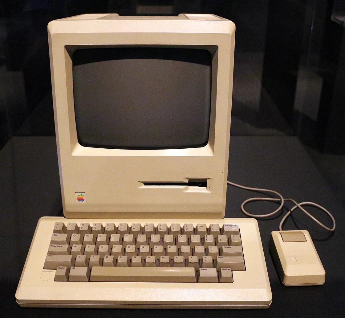
So, how did it actually come about?
When the truth, with the passing of those who lived it, faded, each left behind only a few words to give us a glimpse of the decades ago, but these images hidden in the mosaic of the puzzle, but also enough to be saddened.
The look and image of the Macintosh is itself, the legend itself. So why is it this way? The story behind this is not so simple, as the legend has never 'suddenly' looked like this.
Background: a time of possibilities
The 1970s and 1980s were a time when hardware enthusiasts let their hair down, when the word "Hacker" wasn't completely demonized, and when creativity ran rampant. It was a gathering place where the early hackers were birthed and where the culture of today's Silicon Valley began.
There are, of course, groups of enthusiasts of similar shape, and the 'Home Brew Computer Club' is still often mentioned today, with many of its members not only becoming founders of Silicon Valley tech companies ever since, but creating hardware and software technologies and products that have profoundly influenced the entire tech industry. Steve Jobs and Steve Wozniak were members of this club.
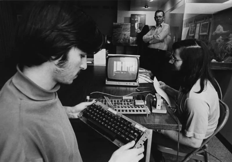
" It's a club of young people - everyone can be an entrepreneur - they like to assemble gadgets at home and make them work." --Steve Wozniak
At the first club meeting, a socially frightened Wozniak coyly told the 30 people packed into the garage about the prototype of the 'personal computer' he wanted to build, which would become the Apple I--
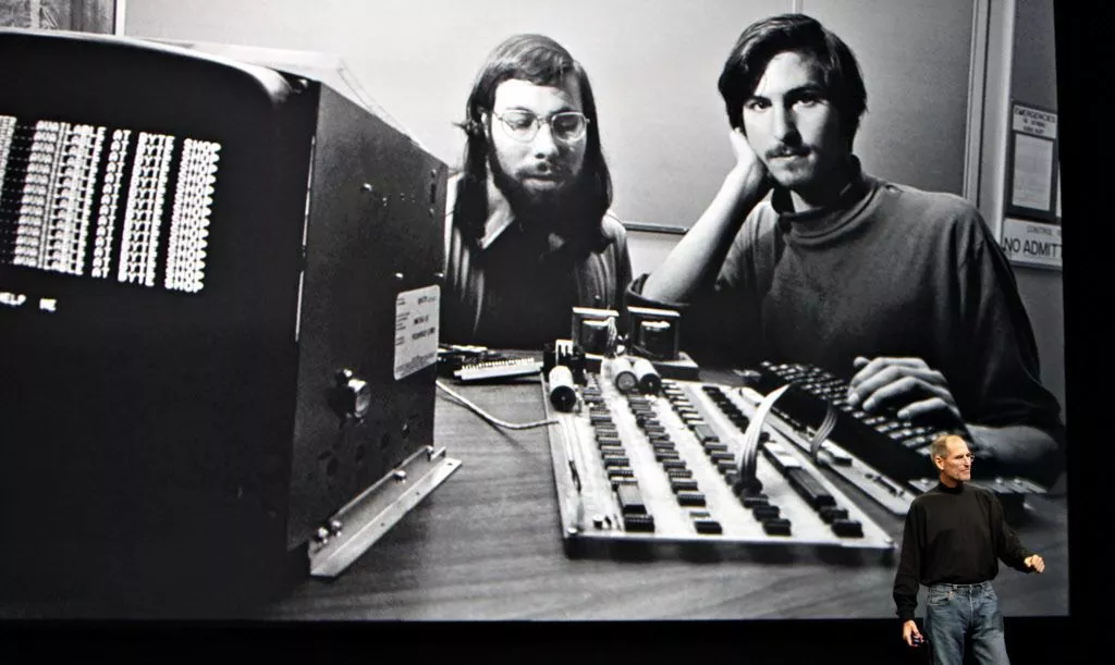
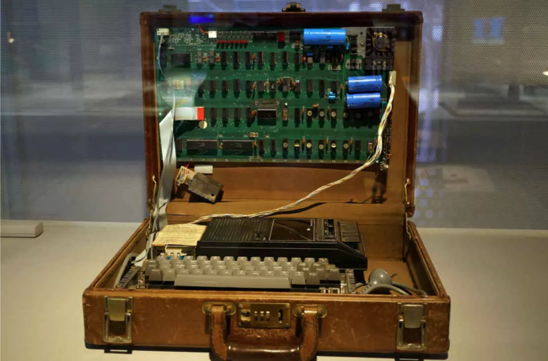
This 8-bit personal computer, which included only a bare board, was Apple's starting point and was released on March 5, 1975, for $666.66 US$. Because of Wozniak's penchant for repeating numbers, the actual number of units sold was 200, which makes every Apple I in existence worth a great deal. The following "complete set", which was DIY'd by its original owner, is now in the Powerhouse Museum in Sydney.
"My idea was to build the first computer with all the components integrated," Jobs said in 1976 at the first Personal Computer Festival in Philadelphia. The idea came to Steve Jobs after looking at the products of his "competitors" in the showroom of the first Personal Computer Festival in Philadelphia in 1976. It was directly after this event that Wozniak perfected many of the next-generation features in his hotel room - such as the color display - and transferred much of his experience designing consoles, which once required hardware, directly implemented out of the box with the help of software.
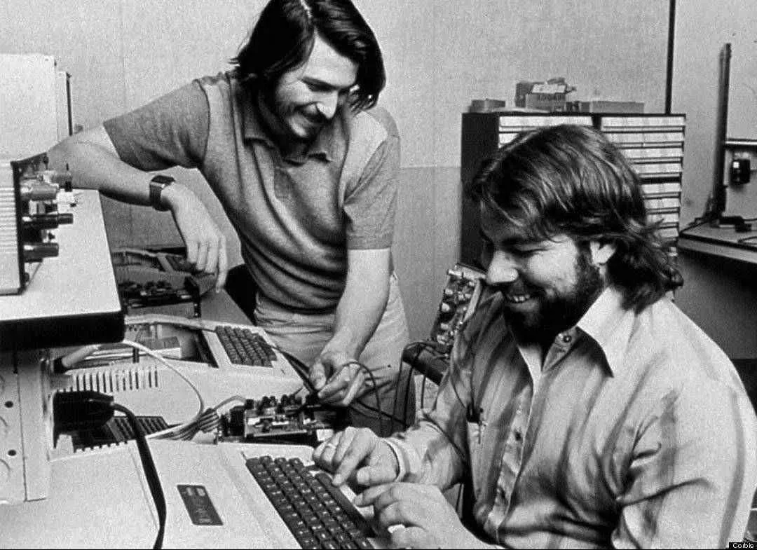
The Apple II was eventually released in 1977, and it was called the "1977 Trio" along with two other personal computers released in the same year, with the The Apple logo was designed as a colored stripe-covered version, and they wanted to use the logo to tell users that it was a personal computer that could output a color interface.
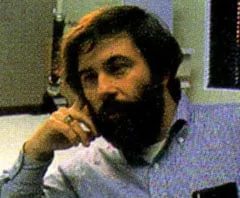
Jerry ManockIn May 1977, Wozniak, as the lead designer and developer of the Apple II, published an article in that year's Byte magazine, the first sentence of which summed up his vision in the opening sentence of the article.
For me, a personal computer should be small, reliable, easy to use and inexpensive.
This statement has, in large part, guided the direction of Apple's subsequent products.
Starting Point: Macintosh's 'Weird Uncle'
It was Steve Jobs who finally completed the Macintosh, but he was not the one who started the project. Instead, the person who originally came up with the Macintosh was Jef Raskin, who wrote the manual for the Apple II.
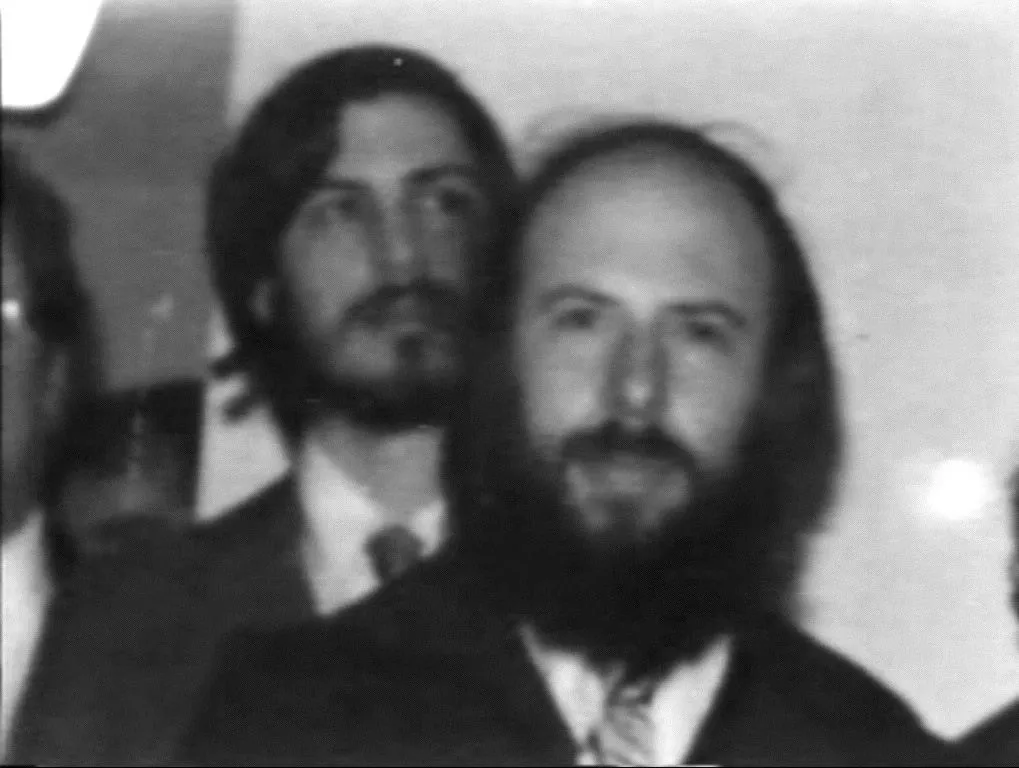
Jef Raskin, who sits in front of Steve Jobs, is different from the 'folk players' like Jobs and Wozniak, recruited during the Apple II Jef Raskin, who was recruited to head up print during the Apple II era, had a solid academic background, with a double B.S. in math + physics from Stony Brook University and an M.S. in computer science from the University of Pennsylvania. As an industry insider, Jef was well aware of the strong resistance to academics among civilian gamers at the time, so when he joined Apple, he simply hid his master's degree in computer science.
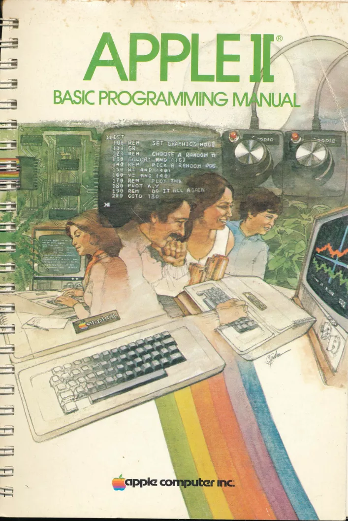
Apple II Basic Programming Manual However, Jobs and Wozniak agreed with Jef when it came to computer technology, and before joining Before joining Apple, they had hired Jef to write the Apple II Basic programming manual, an experience that led to Jef's appointment as manager of the publishing department.
This 'non-technical post' limited Jef somewhat, and it was in the period after he joined Apple that Jef wrote a lot of memos about PCs becoming a consumer product.
In the memo, his vision of the personal computer was much more than what the Macintosh could do later, and rather than a personal computer, the device he envisioned was closer to the later PDA, with multiple professional verticals, modular hardware, and a size portable enough to be extremely expandable. In a way, very close to the Handsrping Visor and later modular concept machines.
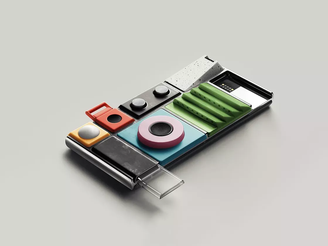
Lapka's conceptual design of Google's modular phone, Project Ara phone, and, crucially, Jef's The key is that Jef's memo is not an uninformed imagination, but is based on a very detailed discussion of the use and development of software, the production and shape of hardware, the way services were provided, the needs of users, sales and distribution, the financial situation and market logic, and even the presentation of advertising, manufacturing support and even communication networks, in a document called [Computers by the Millions (1979)](). Millions (1979)" (https://www.digibarn.com/friends/jef-raskin/writings/millions.html), was the basis of Jef Raskin's motivation and logic for starting the Macintosh project, and later became the key to impressing Apple's executives to start the project.
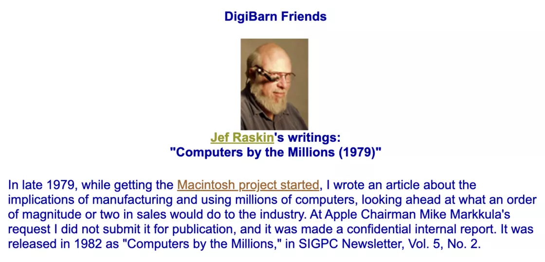
This document helped Jef bypass Steve Jobs and get funding and permission for the project directly from Apple's executive management, starting the project called Macintosh - the Mackintosh was Jef's favorite kind of Apple, which was subsequently changed to Macintosh due to a name conflict. and his initial memo was gradually refined into the landable The Book of Macintosh, which covered his vision of what needed to be accomplished for this personal computer.
Jef Raskin secured a separate office space for the project from Apple executives, along with the authority to recruit original members and sufficient funding. After launching the Macintosh project in 1979, Jef Raskin recruited his longtime partner Brian Howard, tapped Burrell Smith, a talented hardware engineer working in customer service, Joanna Hoffman, who later became part of Steve Jobs' NeXT team, and Bud Tribble, who later worked on the Macintosh UI design and later became senior vice president of software development at NeXT. Joanna Hoffman, who later became part of Steve Jobs' NeXT team, and Bud Tribble, who later worked on the Macintosh UI design (and later became senior vice president of software development at NeXT). He also recruited Bill Atkinson, later a mainstay of the Macintosh team, and Andy Hertzfeld from Apple Services.
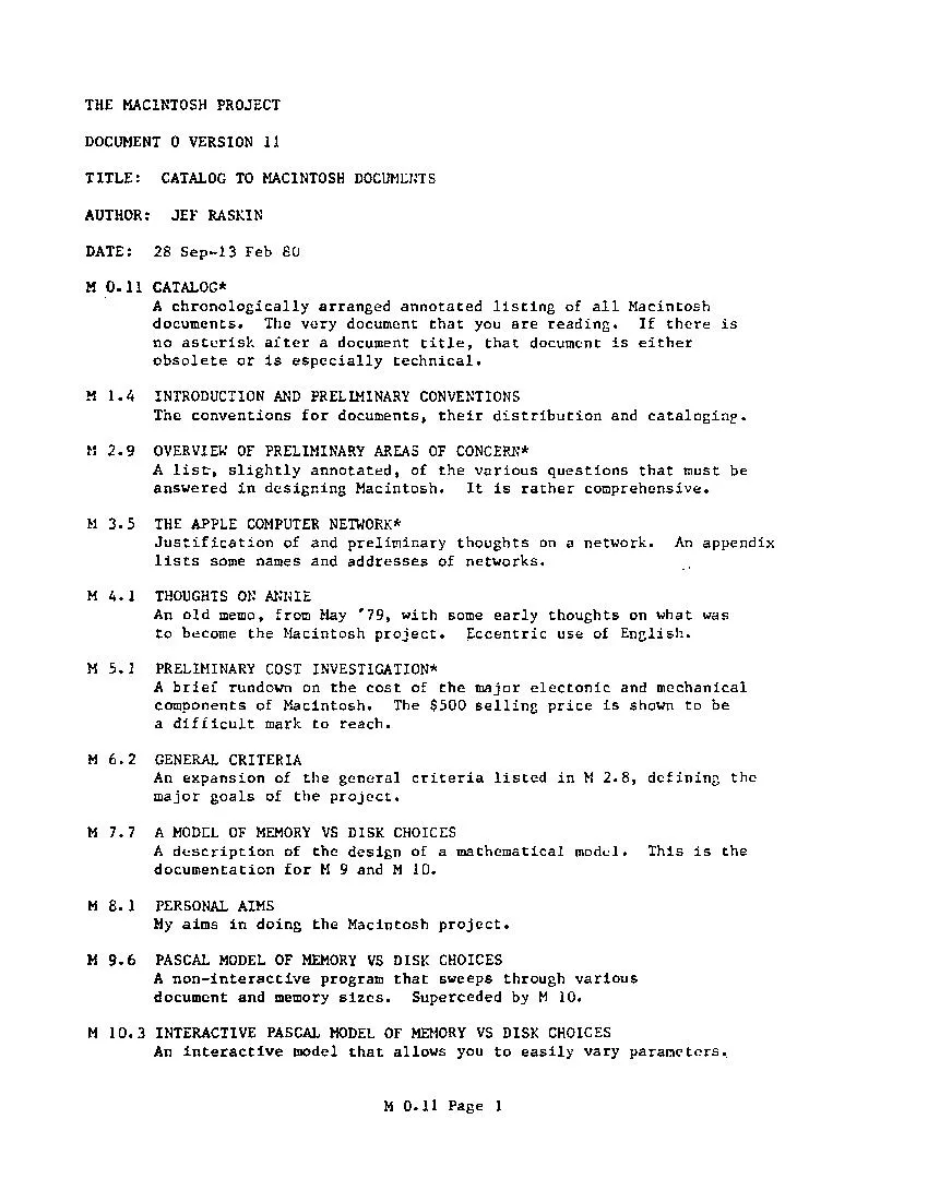
The Book of Macintosh Unfortunately, from 1979 through the vast majority of 1980, Jef Raskin worked on The Book of Macintosh from 1979 to 1980, and the project moved slowly, with many delays and two changes of location. It wasn't until late 1980 that Jobs noticed the slow-moving project, and Burrell's brilliant hardware design piqued Jobs' curiosity.
Jef Raskin left the Macintosh team in 1981 due to a personality conflict with Steve Jobs, and in 1982 Jef officially left Apple to start his own company, which went on to develop a number of great products and was instrumental in the design of human-computer interfaces.
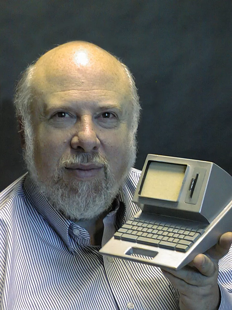
Jef Raskin and the Canon Cat computer model he later designed were featured in a 1996 Steve Jobs interview, "The Missing Interview," which was filmed in 1996. Interviews," filmed in 1996, he unapologetically acknowledges Jef's value as an early creator of the product, but at the same time, he believes that the success of the subsequent Macintosh should be credited to the entire team. In the early years, Burrell often jokingly referred to Jef as "the inventor of the Macintosh," but Andy Hertzfeld, the team's lead developer, argued that Jef was more of a "Macintosh's weird uncle" than a "Macintosh's father.
But Jef's vision for the Macintosh was built to coincide with Wozniak's ideas, and the legacy of those ideas is more or less reflected in the Macintosh line.
Taking over: Steve Jobs takes over the Macintosh
After the Apple II, there were three successors to the hit model, the Apple III, the Lisa, which Jobs was leading at the time, and the Macintosh, then internally codenamed Annie. The costly Lisa project was seen as promising by the entire Apple management, and Jobs was forced to leave the Lisa due to conflicts between him and the executives.
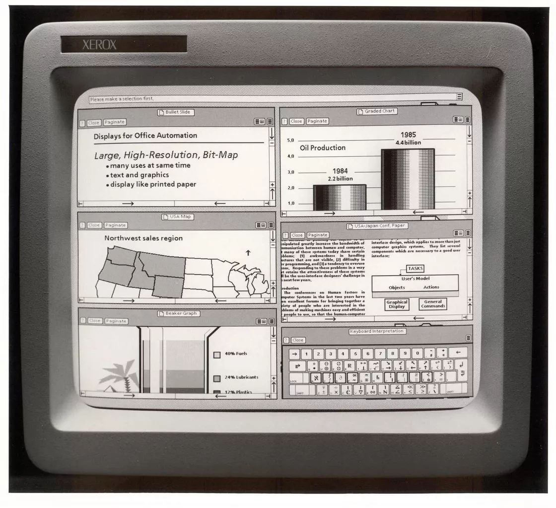
Graphical interface created by Xerox Being an activist, Steve Jobs thought Jef Raskin was an insufferable theorist, "a terrible idiot". Yet it was his perceived 'idiocy' that prompted Jobs to go to Xerox and 'steal' the concept of the GUI - a deal Jobs actually struck with $1 million worth of Apple stock at the time (the value of the stock had doubled 18 times since Apple went public).
In late 1979, Jobs finally took the team to see the graphical interface at Xerox, which pointed the Macintosh and Lisa projects in a new direction. When Andy Hertzfeld, who was responsible for the core operating system interface, officially joined the team in February 1981, Bud told him something: Jobs insisted that the Macintosh be available in early 1982. Andy questioned this 'unscientific' timing, and Bud then made a remark that became the most famous tag on Jobs.
The best adjective to describe the best way to describe this situation, to use a term from Star Trek, is that Jobs had a "reality distorting force field." ...... When he was there, reality could be changed, and he could convince people to believe in almost anything.
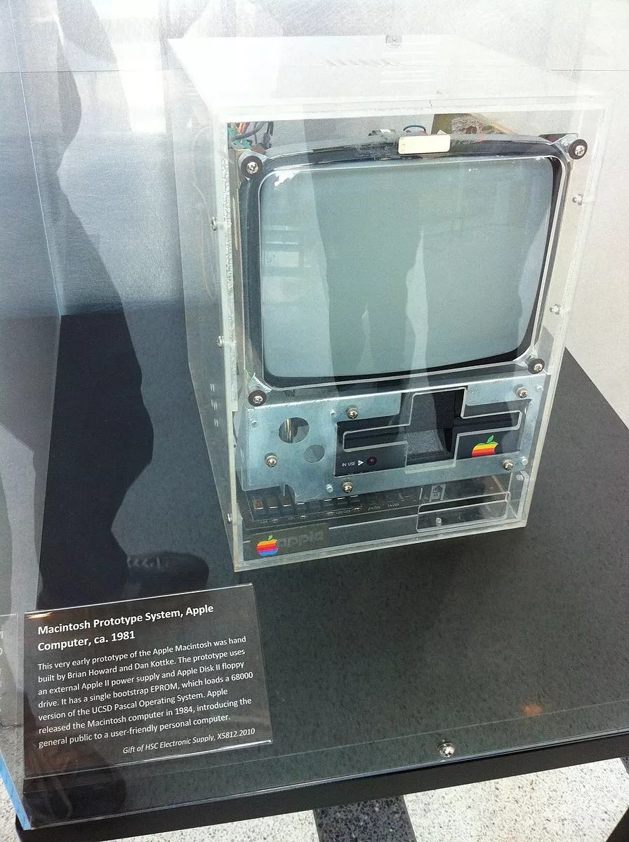
And thanks to Steve Jobs' 'reality distortion force field', by the time Andy joined the team to start designing the GUI interface, Brian Howard and Dan Kottke had the prototype assembled and sitting on Bud's desk, who was in charge of Macintosh program development, by the time Andy joined the team to start designing the GUI interface. The components lay quietly within the metal frame of the acrylic pieced case, with the colorful striped Apple logo affixed to it.
It's not only the software and hardware teams that are baptized by the reality-distorting stance; the industrial design process is just as torturous.
The original idea: horizontal bento boxes
As the original team leader of the Macintosh, Jef Raskin had his own vision for the computer.
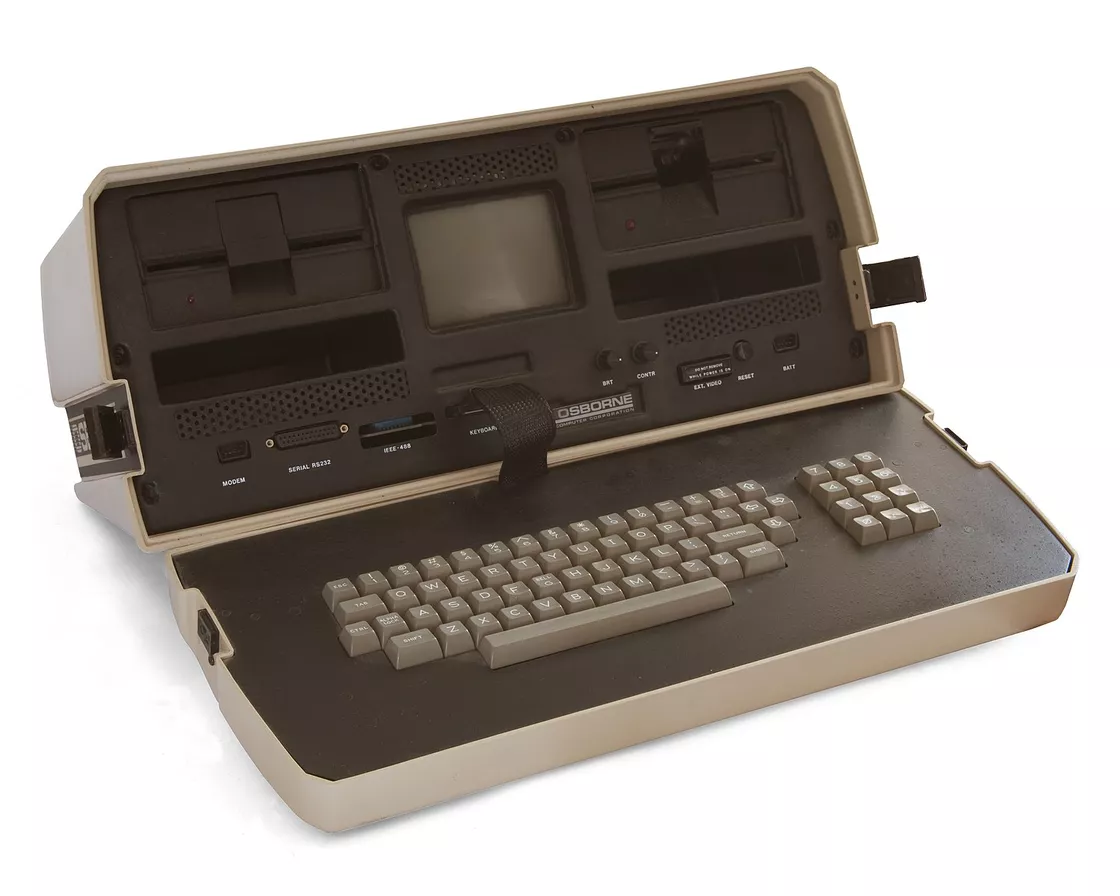
The earliest portable computer, the Osnorne IJef Raskin, was originally conceived as a folding lunchbox similar to the Osnorne I structure. Interestingly, not only was the Osnorne I the first truly portable computer, but its creator, Adam Osborne, was a member of the Home Brew Computer Club, along with Steve Jobs.
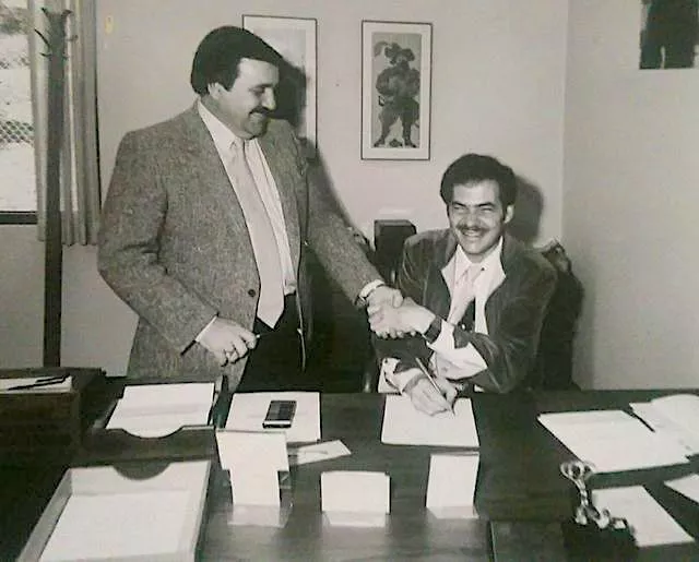 Tom Cooper and Adam OsborneWith Steve Jobs' intervention, Jef's sketches and ideas were overturned, and he was left to His hardware design ideas were buried in his own head, and Jef's involvement in the Canon Cat project should provide a glimpse of his original design vision: the
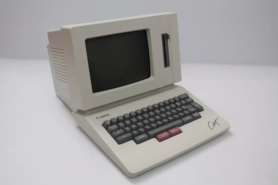
Canon Cat Computer
First Exploration: Like a Porsche
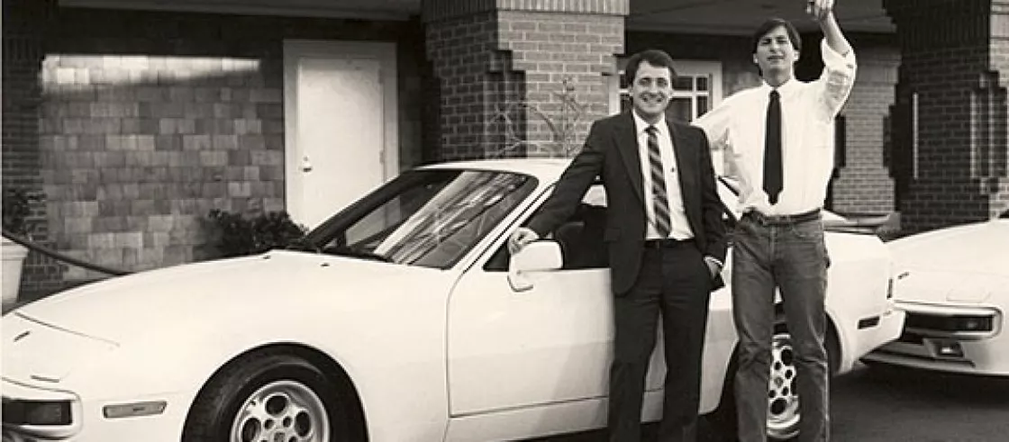
One night in March 1981, Andy, the designer, was about to go back to work after dinner when he saw Steve Jobs discussing the Macintosh prototype with James Ferris, then director of creative services at Apple. James Ferris, Apple's director of creative services, discussing the prototyping of the Macintosh.
We need a classic look that won't go out of style, like VW's Beetle ...... No, it should be like a more sensory oriented line of cars, like a Ferrari or something. Not a Ferrari, that's not right either, it should be like a Porsche.
At this stage, Steve Jobs was driving a Porsche 928, and his pursuit of sophisticated industrial design extended from his life to his work, but this 'abstract' description of perception eventually had to find a way to land on concrete contours and curves.
Remember Jerry Manock, the HP industrial designer who designed the look of the Apple II? He was finally recruited by Steve Jobs to join Apple in 1979 and went on to lead the design of the Apple III, followed by the Macintosh.

Jerry Manock as he looks nowIn leading the industrial design process for the Macintosh, he was required to continually confront Jobs such abstract 'needs' that the professional design experience he had could initially only suggest improvements in the details. For example, he proposed the use of icons instead of text names on the Macintosh's exterior, making the entire computer more international in appearance.
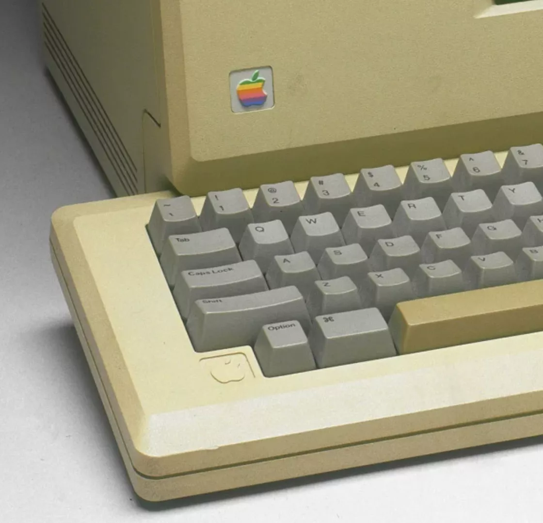
All the above exploration process did not satisfy Steve Jobs. The need for differentiation, the Apple II without a display and the massive Lisa led Jobs to set his initial goal in the direction of a 'portable computer'.
"Minimum desktop size" design
Everyone looks for inspiration in a different way. the early 80's was a time when computers were gradually being "electrified" from professional equipment, and Jobs liked to go to the home appliances section of Macy's for inspiration.
After many trips to Macy's, Steve Jobs approached Jerry and claimed he had a better design in mind. He found inspiration in the then-hot Cuisinart food processor, and they needed to design a "stand-up computer with a small enough footprint that the screen and mainframe were integrated.
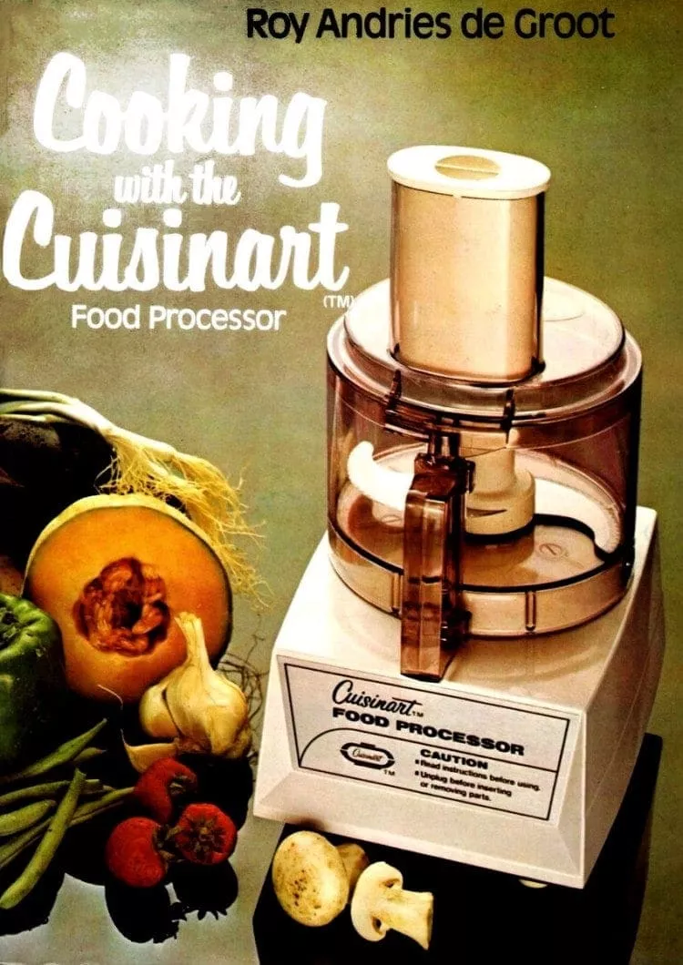
Cuisinart Food ProcessorWith this in mind, Jerry recruited Japanese-born industrial designer Terry Oyama to join the team. He later did most of the design work for the Macintosh's landing.
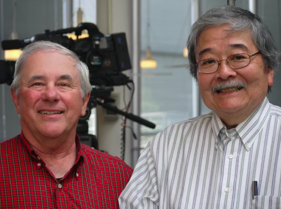
Years later Jerry Manock and Terry Oyama togetherAfter hearing about Steve Jobs' needs, Jerry They placed the floppy drive under the CRT monitor for a minimalist design, which not only saved external space, but also allowed the Macintosh screen and floppy drive interface to form a playful face. This fun imagery echoes graphic designer Susan Kare's classic Happy Mac smiley face.
Affordable silhouette and details
In order to add a more intimate feel to the whole Macintosh and reduce the 'sharpness' it gives, the corners are mostly beveled.
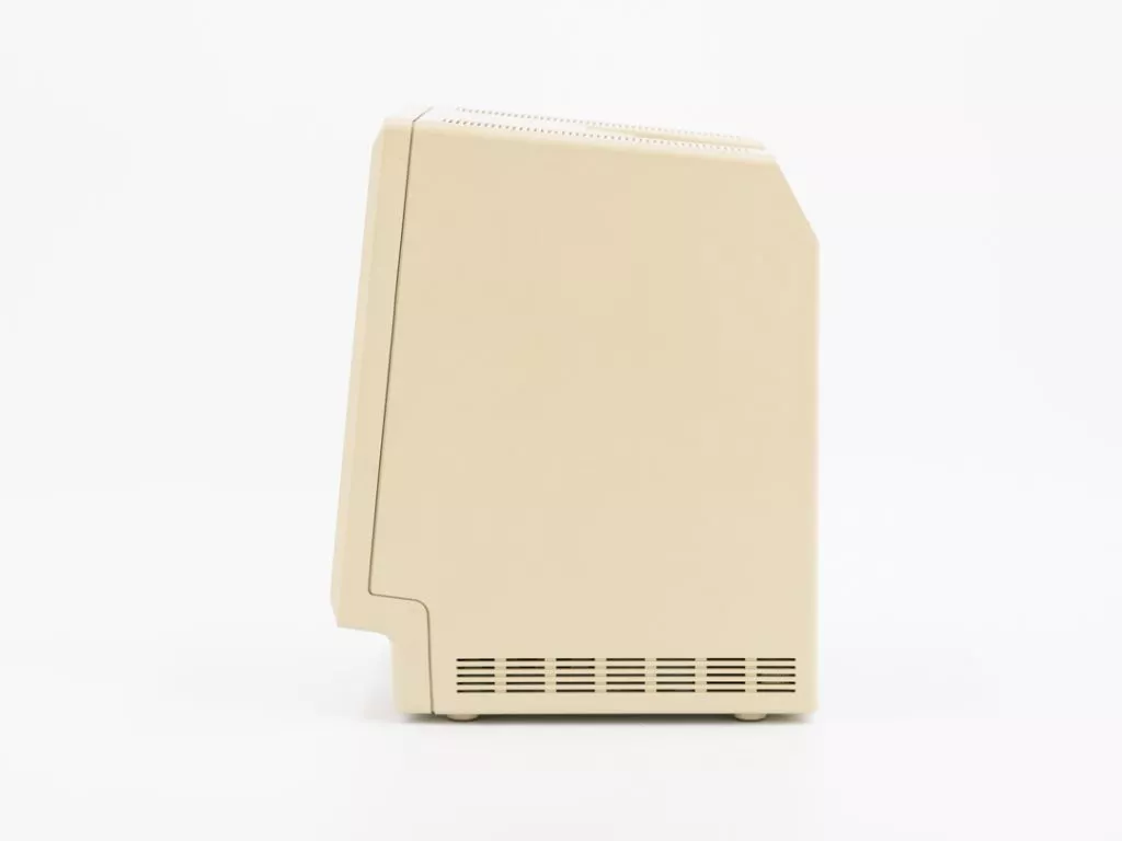
But that's not enough. To reinforce the 'facial features' on the front, Terry Oyama made a recessed design on the bottom of the front, which on the one hand allows the keyboard to fit right in, giving the computer a more nested and integrated feel, and on the other hand, this notch also reinforces the 'human face' feature on the entire front of the Macintosh, creating the visual features of the 'chin' of a human face and the 'neck' underneath, giving the entire computer a This gives the entire computer a highly "anthropomorphic" visual identity.
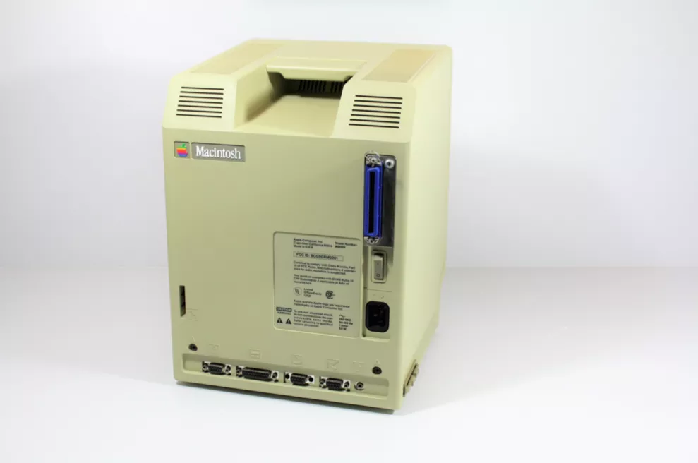
Jerry Manock, who was responsible for designing the second half of the shell, also reinforced the "availability" of the entire computer. In cognitive science, 'availability' refers to the possibility of interaction that a person can perceive something to offer. In industrial design, a design with good "availability" presents a function to the user in a "self-explanatory" way, and Jerry's addition of the carrying handle notch on the back of the Macintosh uses an empty slot to provide "portability" to the user.
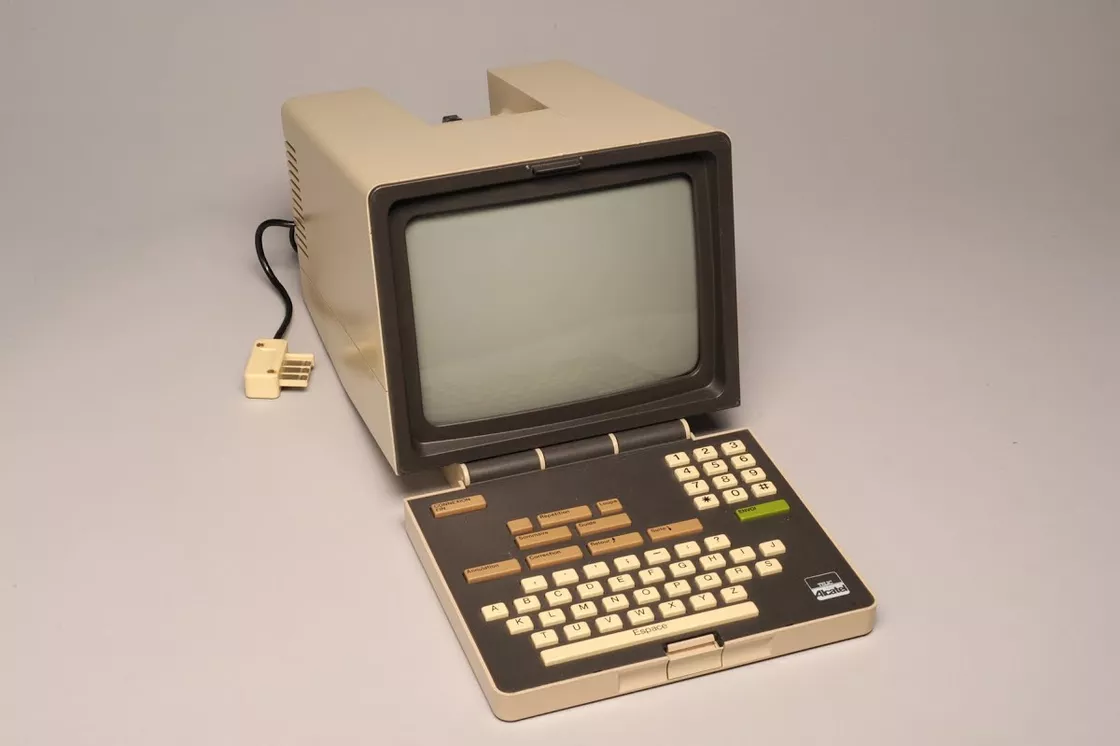
Minitel TerminalThe design of this carrying handle could have been derived from the French Minitel Terminal, which came out much earlier, after all. Although this design was not original to the Macintosh, it is a user-friendly design that Apple has persistently passed on to today's products: the
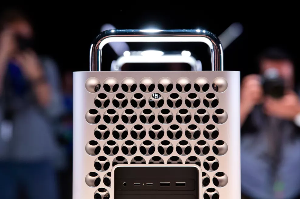
The 'hardware philosophy' of going for neatness
Steve Jobs' father had taught him that even when making the backs of closets and fences, he should never do it perfunctorily, knowing it was there even when no one else could see it. This meticulous design spirit is also evident in the Macintosh.
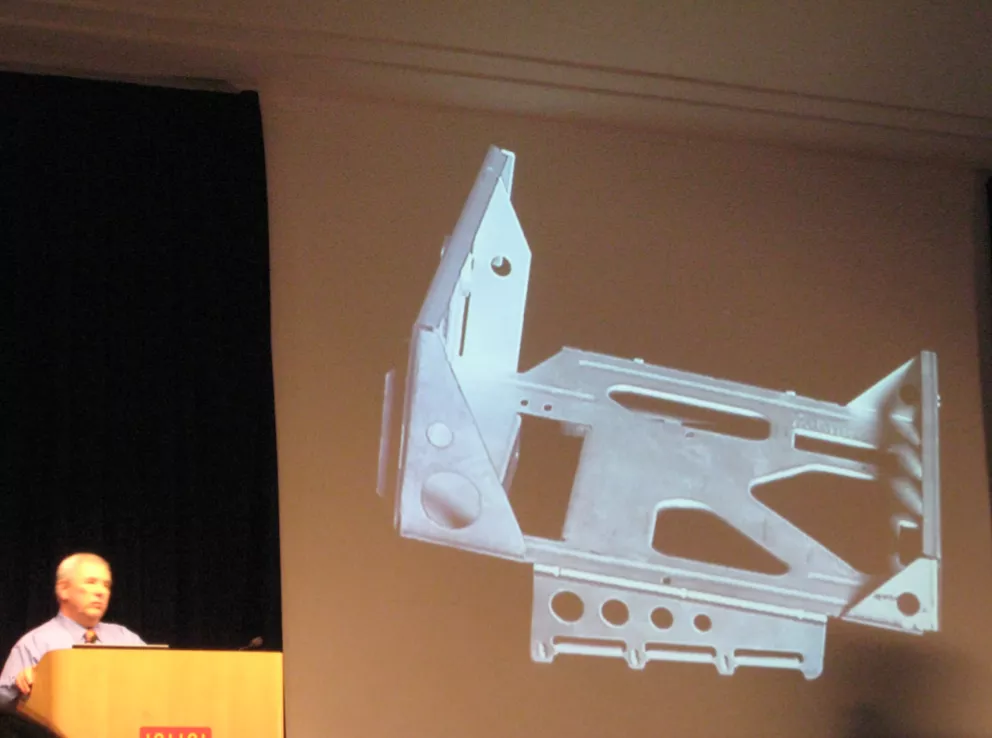
Jerry Manock showing the internal frame of the MacintoshIn designing the internals, the motherboard was placed on the bottom and side, and to make the most of the internal space, the power supply was placed on the side motherboard inside the mainframe. This "hardware aesthetic" of trying to keep the space inside and out as clean and tidy as possible was always the goal of the two industrial designers, although this approach somewhat affected the cooling of earlier Macintosh models. The Macintosh was a "rat's nest".
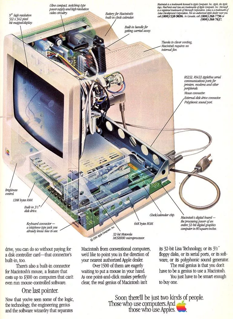
But the result is obvious - a power cable, a mouse cable, and a keyboard cable, which was the hardware complexity that users in the 80s had to deal with. Years later, many phones have more than three cables of various kinds built in.
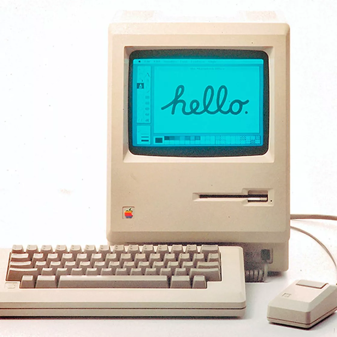
Years later, in an interview, Terry Oyama exclaimed.
Even though Steve didn't draw any lines, his ideas and inspiration made the design what it is now. To be honest, before Steve, we didn't know what 'friendly' meant in terms of computers.
Extending aesthetics to peripherals
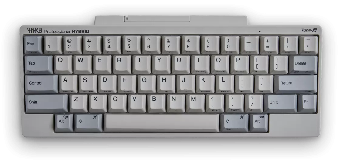
The "minimalist" design goal also extends to the keyboard, and the Macintosh model M0110 is now a classic among desktop portable keyboards.
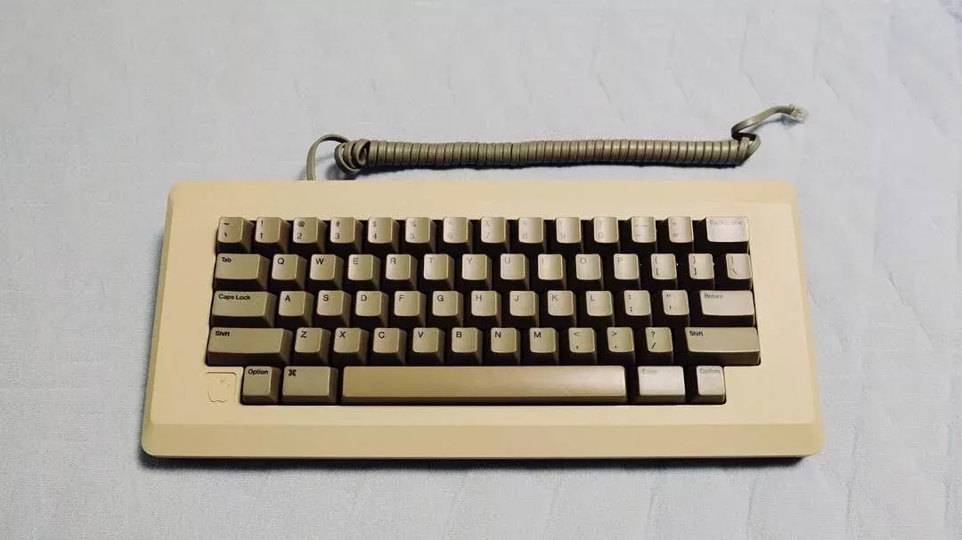
The M0110 and the host computer use the same chamfered keyboard on which the Apple logo is placed in the lower left corner of the keyboard, retaining only the necessary keys in the mapping design To give this keyboard the ultimate in simplicity, years later Eiichi Wada and PFU released the famous HHKB (Happy Hacking Keyboard) keyboard based on the M0110's layout, which is now considered to be the most suitable professional keyboard to turn into.
And the mouse design is equally iconic
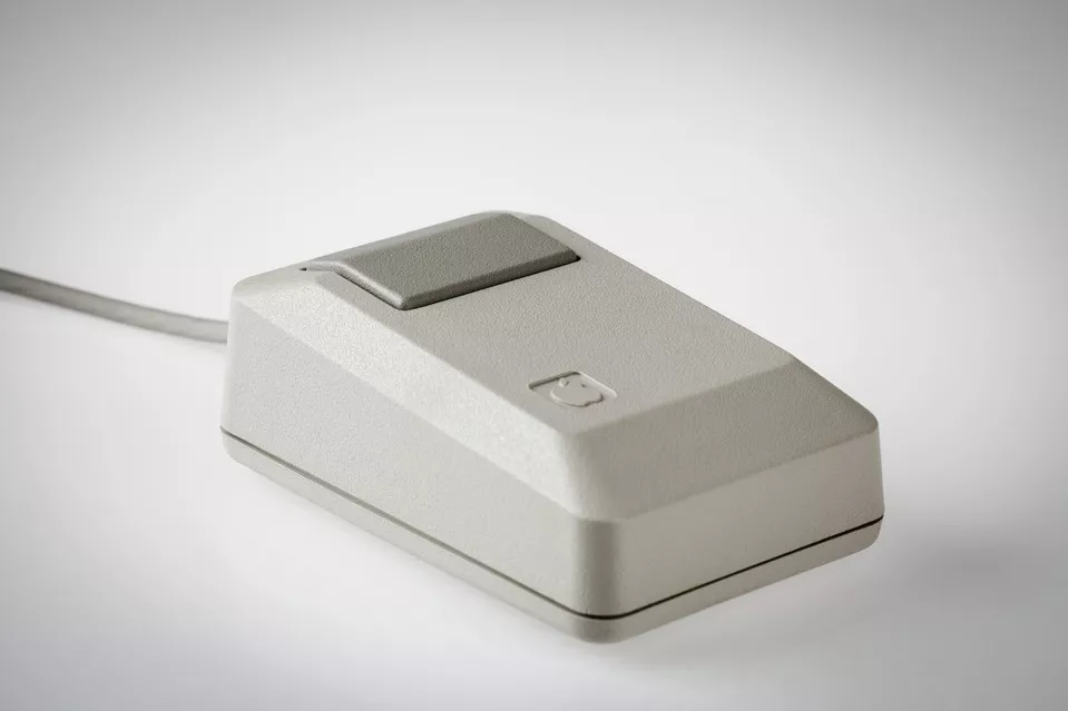
The single-click button makes it so clear and intuitive to interact with - at least before the Before the world was tamed by the 'experience' of double-clicks and right-click menus, this intuitive single-click design was very logical for the time.
The creator deserves to have a name
Completing the design and going into production, Jobs had the Macintosh participants all leave their names on the patent application for the computer, in which you can see everyone's name, including Jef Raskin in the lower left corner, Terry Oyama and Jerry Manock's signatures in the upper left corner, Jobs' habit of lower-casing his initials, which, if you look closely, will find his name in the fourth line of the middle column.
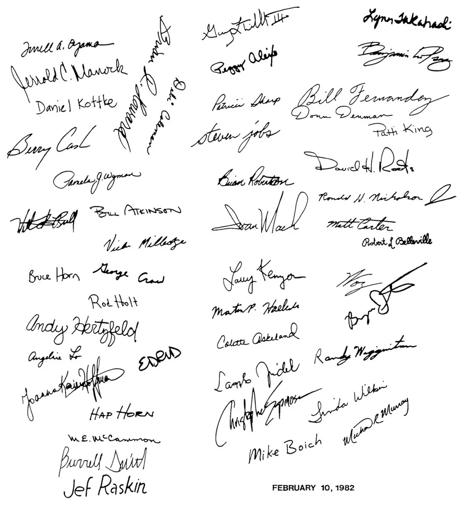
Every designer involved in the industrial design of the Macintosh has left his or her name on this 1982 patent design book. name.
Posted by Macintosh @ 1984
In October 1983, the Macintosh was launched. Unable to experience it ourselves, we can only get a taste of what it was like today with this video.
The launch was all about the product, and Steve Jobs made it memorable in just five minutes with careful planning. The contrast between the misguided route of rival IBM and the unique positioning of the Macintosh, the stunning visualizations and the wealth of applications that pulled the eyes of 80s users with every frame, literally whetted everyone's appetite.
The demonstration of the Macintosh was presented in the simplest of scenarios, taking the computer out of the bag, assembling it skillfully, inserting the floppy disk, and walking away in style, with the soundtrack of Chariots of Fire playing in the background, allowing the Macintosh to show off its graphical interface, and everything running flawlessly and everything speaking for itself.
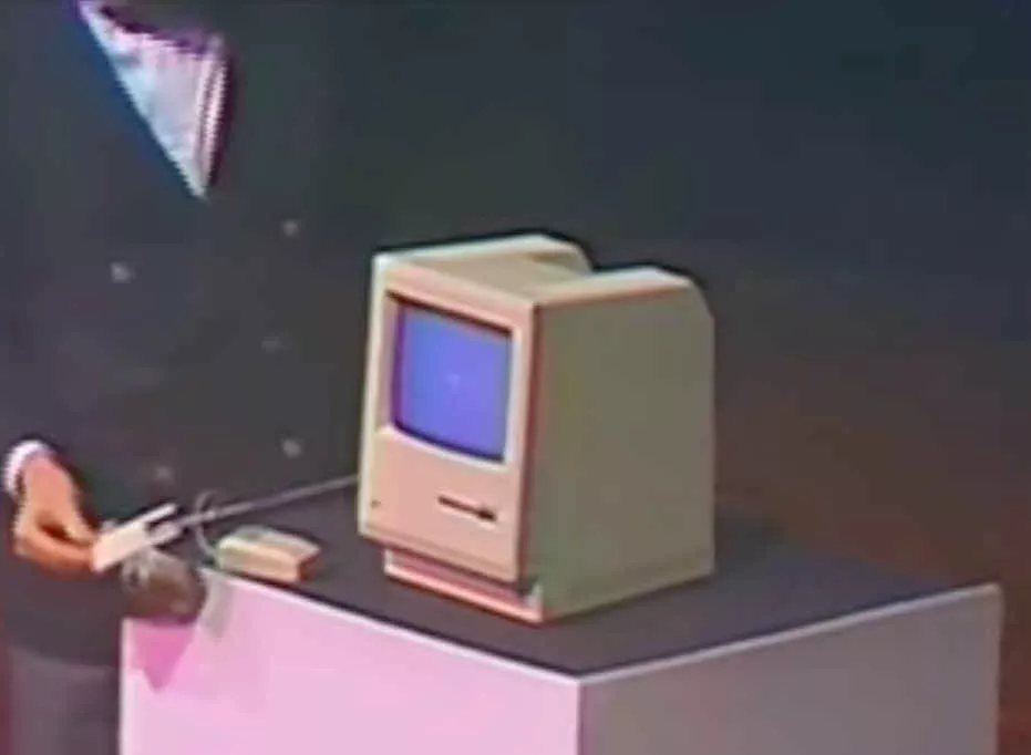
Finally, it's still Macintosh speaking for itself: "Hello, I'm Macintosh, and it feels good to be out of the bag ." The atmosphere reached a crescendo as the room rose to its feet and screams drowned out Macintosh's final, bizarre monologue, which was the work's response to its author.
Obviously, I can talk. But right now, I want to sit back and listen. Next, let me be very proud to bring out a man who is just like my father - Steve Jobs.
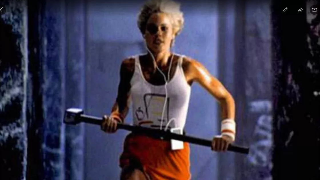
And the plug ad for "1984" at the Super Bowl the following January was another classic - -the only female athlete of color in a George Orwell anti-utopian world of only black, white and gray, smashing hard into the dark old order with a hammer, the white vest with the Macintosh logo.
Where once Steve Jobs merely expressed his determination to confront convention in an internal speech with "It's better to be a Pireate than join the Navy," the "1984" ad stands as a rebel against the giants as the world looks on, uniting the common man under the technological tide, the those who dare not willingly rebel, and the unseen minorities.
The ad, titled "1984," is more of an emotional intertextual, spiritual call to action than the appeal of a specific feature presentation.
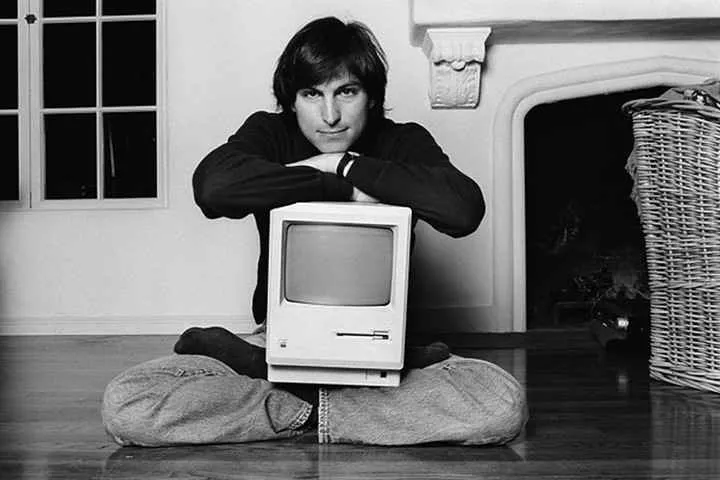
Clearly, in Steve Jobs' eyes, the Macintosh was as important as his children, as distinct as a flag.
Epilogue: a drop in the bucket, still a hit
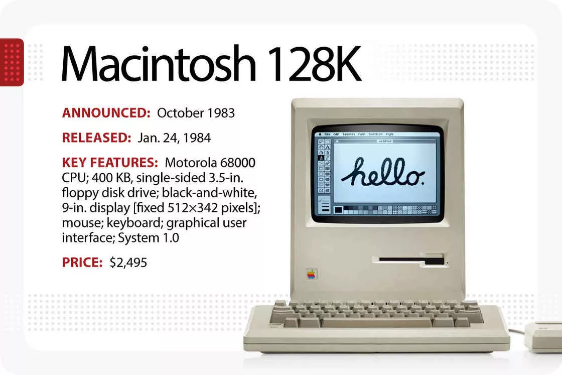
Macintosh certainly paid a price for innovation.
Jobs enabled elegant pixel fonts, twenty or thirty times the size of the passing characters, which took up a lot of space and led to a lack of memory and slow operation. There was no internal hard drive, and the only way to copy data was to load and unload floppy disks back and forth. Steve Jobs didn't like the noise and eliminated the fan, and the lack of fan cooling caused so many components to fail that the nickname 'beige toaster' became a buzzword that hindered sales. The truly usable Macintosh 512K missed its best launch, and a series of problems in selling and promoting the Macintosh set the stage for Jobs' departure.
But in today's perspective, it's a symbol of its time, always a hit. with its bold, clean design and user-friendly graphical interface, the Macintosh accelerated the popularity of the personal computer and set the benchmark for portable personal computing. Today, I'm still using a fanless Apple computer, the MacBook Air with its built-in M1 chip, but the difference is that it's a tour de force in terms of performance and functionality. We still feel their design legacy in every Mac computer.
Only a few people, including Steve Jobs, had a chance to see the Macintosh from conception, to rework, to polish, to final release. Today, you and I can probably only piece together the process through the words recorded from different perspectives.
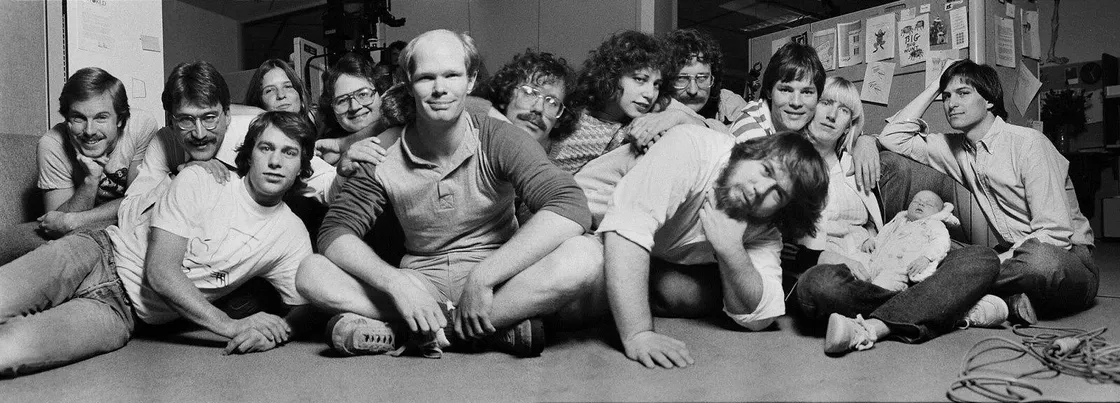
Great design and memorable classics never happen overnight, and every thought and revision behind the Macintosh deserves to be known, and every Each creator's name deserves to be remembered because, in large part, they did change the world.