Microsoft is planning to launch windows 11 22h2 in the near future, which is also the first feature update received since the release of windows 11. Unlike many previous windows 10 updates, the 22h2 version has a number of noteworthy improvements and new features. Neowin, a foreign technology media, made an inventory of the new functions to be introduced in the 22h2 function update.
Catalogue
1. Improvements to the start menu and taskbar
2. Improve the file manager and optimize window management
3. Various obvious UI adjustments
4. Accelerate the migration of control panel to settings application
5. Redesigned Task Manager
6. Improvements to settings and Applications
7. Barrier free function
8. Some annoying places
Note: Microsoft has not announced the release date of windows 11 22h2. According to reliable sources, the update will be released to the manufacturer on May 24, 2022.
1. Improvements to the start menu and taskbar
It can be said that the start menu and taskbar are the most controversial changes in Windows 11. Microsoft decided to create a new taskbar and start menu for its latest operating system. As a result, many things were cut off. New features and lack of beloved features make many windows 11 users feel uneasy, so Microsoft hopes to solve this situation by configuring several obvious improvements for windows 11 22h2 in the taskbar area.
- ● drag function regression**
In the initial version of windows 11, the biggest complaint related to the taskbar may be the lack of drag and drop support. Windows 11 22h2 solves this problem here. It allows you to grab a file and drag it to an open application to bring it to the foreground. You can also drag the file to the "show desktop" area in the lower right corner to copy the file to the desktop.
It's a little weird to achieve. For example, when you hover a file over an open application, windows displays a stop icon. Technically, it did what it should do, but it felt like a traffic light with both green and red lights.
- ● more fixed and less recommended content**
Another confusing thing is that the start menu allows you to pin an application to the taskbar from the "all applications" list, but you can't choose pin from the "pinned" section.
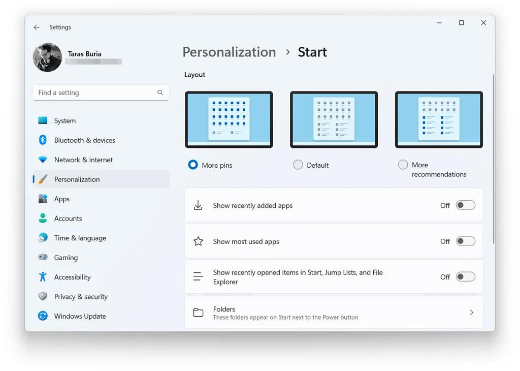
Microsoft doesn't want windows 11 users to choose to get rid of the "recommended" part of the start menu, but it lets you make it smaller. Windows 11 22h2 has three new start menu layouts: more fixed, default and more recommended. Disabling recommendations will still leave a large blank area in the start menu. You can't get rid of the "recommended" part, but at least you can make it smaller and get more space for fixed applications.
- ● folder on Start Menu**
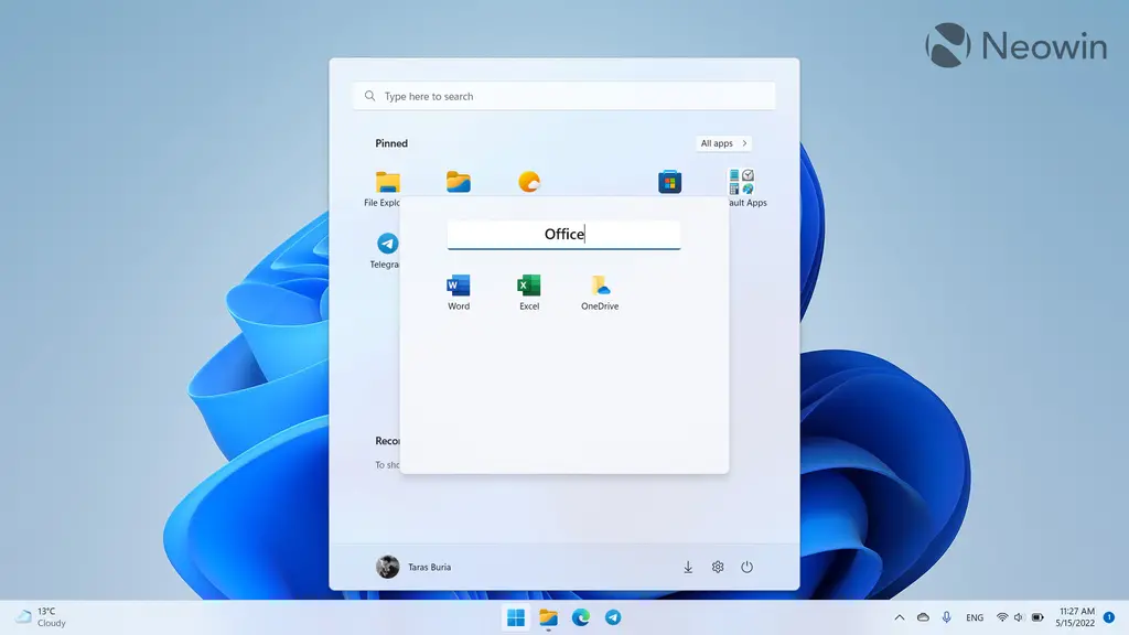
In addition, you can quickly enter the start menu settings by right clicking the open start menu. The folders on the start menu now feel more general and more like Android / IOS. You can drag an app to another app to form a folder, add more apps, delete existing apps, and rename the folder.
- ● new gestures**
The only thing missing is the option to quickly delete a folder with the right button. You need to drag each application from the folder to delete it. Due to several new gestures, in Windows 11 22h2, the start menu and taskbar are easier to operate on the touch screen computer. Here are these gestures:
⊙ slide up and down from the taskbar to open and close the start menu.
⊙ slide left and right on the "start" menu to switch between pinned applications and the list of all programs.
⊙ slide up and down from the lower right corner of the screen to turn on and cancel the quick setting.
● taskbar optimized for teams**
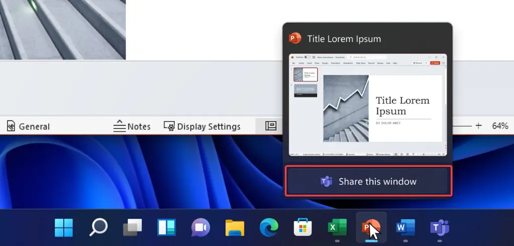
Microsoft teams users now have two convenient call related functions. The first is the ability to mute your microphone using the microphone icon in the notification area (developers can optimize their applications and support this feature in their messenger). The second is to let you quickly share an open window. Hover over an application on the taskbar and click "share this window".
- ● improve the fast setting of Bluetooth**
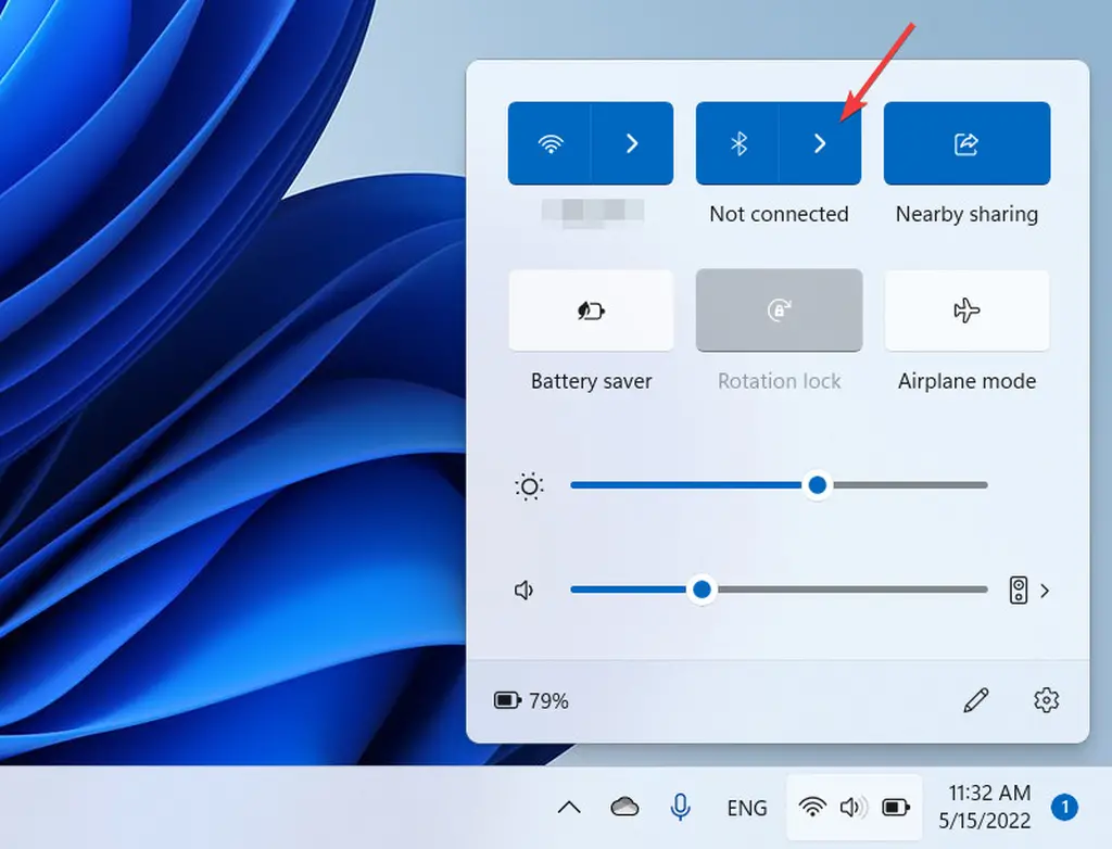
Windows 11 22h2 brings an updated quick setup menu. The main improvements focus on Bluetooth. You can quickly find and connect to a Bluetooth device without navigating to the settings application. Many users want Microsoft to make this change, and we are glad to see that Microsoft listens to user feedback.
Pairing a new Bluetooth device in Windows 11 22h2 is now as fast as connecting Wi Fi. There is no need to set up the application.
When it comes to fast setting, it is also worth noting that Microsoft redesigned the battery charging indicator. The new version is easier to read, especially when the battery is low. You will find the same battery indicator on the lock screen.
2. Improve the file manager and optimize window management
As of the time when Microsoft released a candidate version of windows 11 document manager, there was no commitment to this feature. However, the operating system still provides considerable improvements and new functions for file explorer.
- ● quick access to files**
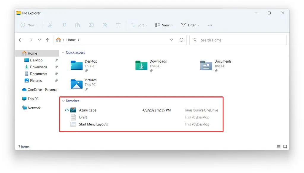
File explorer now allows you to pin specific files to quick access in addition to folders. In addition, Microsoft renamed the quick access section "Favorites" to help windows users better understand how this section should work. Do you have a frequently accessed file? As long as it is fixed on the "Favorites", it can be permanently available on the home page.
- ● folder Preview**
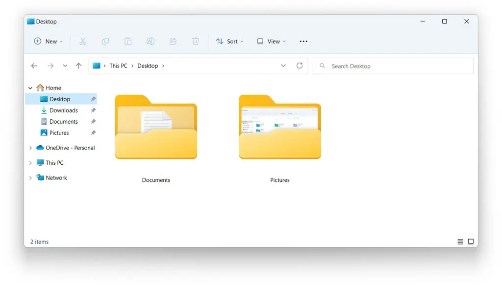
Here is another function that Microsoft will restore after strangling windows 11 when it is initially released in 2021. The file explorer in Windows 11 22h2 can display previews on folder thumbnails.
File explorer in Windows 11 displays folders with thumbnail previews
Unfortunately, unlike windows 10, the folder preview in Windows 11 22h2 displays only a single file. But it's better than nothing.
- ● better integrate onedrive**
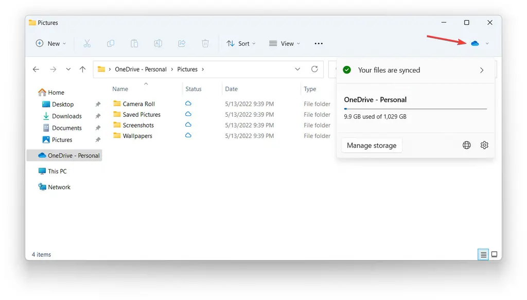
In Windows 11 22h2, it's now easier to check your onedrive status and storage. File explorer has received a new button that can trigger a pop-up window for more information about your onedrive. You can see how much space is left, check the synchronization status, open onedrive for web, and enter onedrive settings. This is not the most groundbreaking change, but it makes the use of onedrive in Windows 11 slightly more convenient and intuitive.
- ● new shortcut for copying file path**
Press Ctrl + Shift + C to copy the path of the selected file without opening the right-click menu.
- ● improve snap layout**
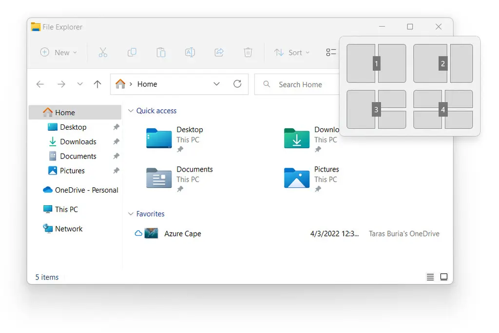
It is now easier to grab windows on the desktop using the touch screen or mouse. Grab a window and drag it to the top of the screen to display the available snap layouts and quickly schedule other applications. This feature is customizable, so if you don't like it, you can disable it.
If you prefer to use keyboard shortcuts to perform tasks, you will be glad to know that you can now press Win + Z and the corresponding number keys to create a snapshot layout.
Previously, you could only trigger the snapshot layout by hovering over the maximize / minimize button, which is not the most convenient choice for tablets or PCs with touch screens. Improved snap layout and better keyboard support in Windows 11 22h2
3. Various obvious UI adjustments
- ● volume and brightness slider**
Microsoft finally abandoned the old and outdated Windows 8 style volume and brightness sliders. Instead, windows 11 offers clean, compact and modern metrics, right above the center of the taskbar.
- ● windows spotlight for desktop**
Spotlight 11 extends Windows desktop. Now you can ask Microsoft to change your wallpaper with the pictures extracted from Bing. This feature also provides easy access to more information about specific pictures.
You can navigate to settings & gt; Personalization & gt; Background & gt; Personalized background & gt; Windows spotlight to enable windows spotlight on the desktop. Note that opening windows spotlight places an additional icon on the desktop. Disabling windows spotlight is the only way to remove the icon.
- ● update lock screen**
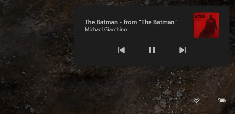
The lock screen in Windows 11 has been updated with media control to follow the general design language of the operating system. This is a minor change, but it helps to create a slightly consistent user interface.
- ● update icon to enable mica effect**
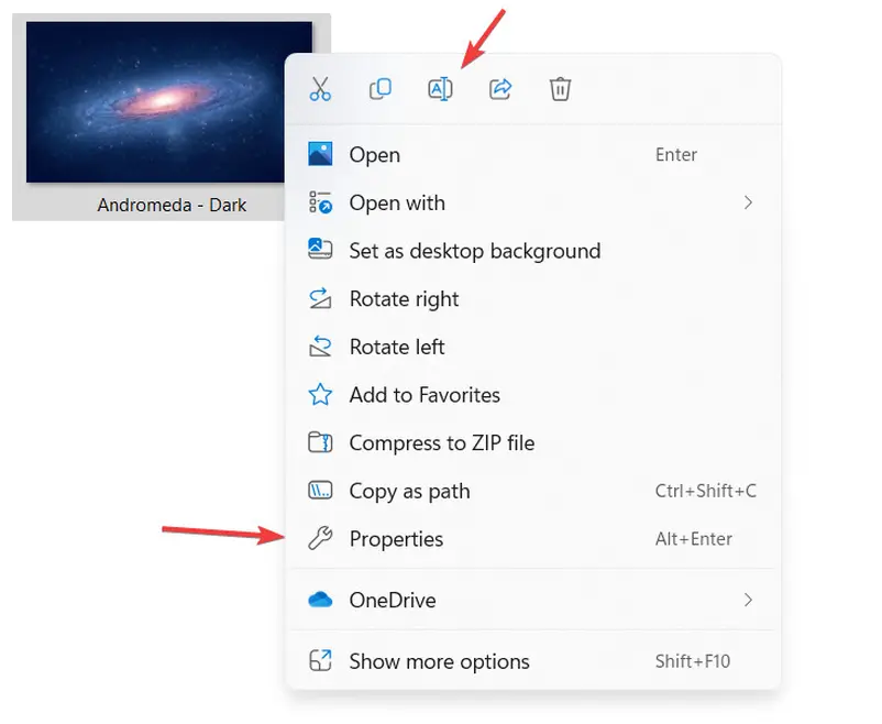
Microsoft has made some adjustments to make the right-click menu in Windows 11 easier to understand. The company changed renaming, attributes and optimization icons to improve discoverability and consistency.
Finally, the mica effect now appears in more areas of the entire operating system, especially on the window title bar.
4. Accelerate the migration of control panel to settings application
Windows 11 22h2 continues to migrate traditional control panels to Windows settings applications. In this version, Microsoft has made some changes to redirect the following parts of the control panel to the settings application.
● the "programs and functions" part of the traditional control panel is now "Settings" in the "Settings" Application & gt; "Application" & gt; Opens under the installed applications page.
● uninstalling windows updates is now done in the "Settings" application, not in the control panel.
● some network and device entries in the control panel can now be redirected to the corresponding pages in the setting application.
● you can manage advanced sharing settings in "advanced network settings" in the settings application. This includes network discovery, file and printer sharing, and public folder sharing.
5. Redesigned Task Manager
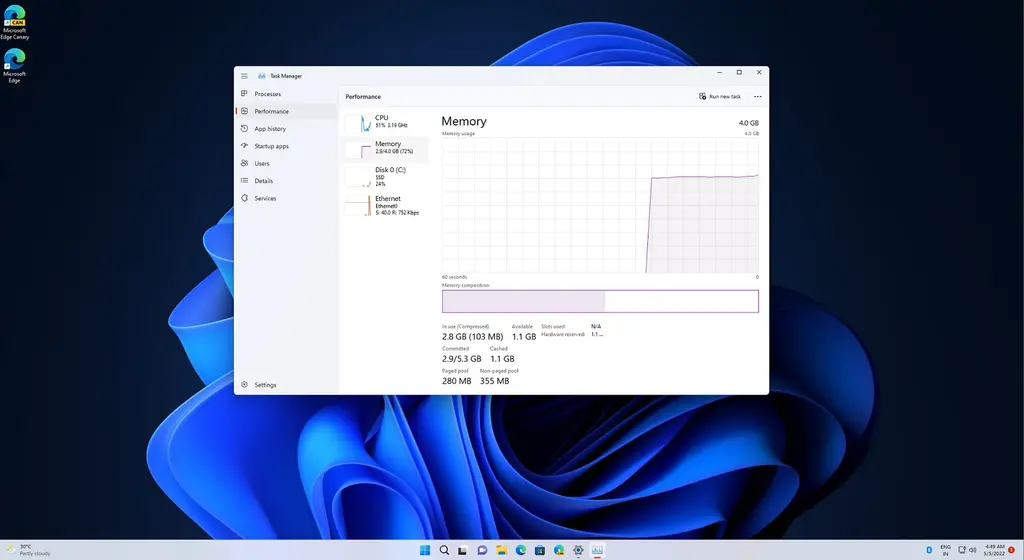
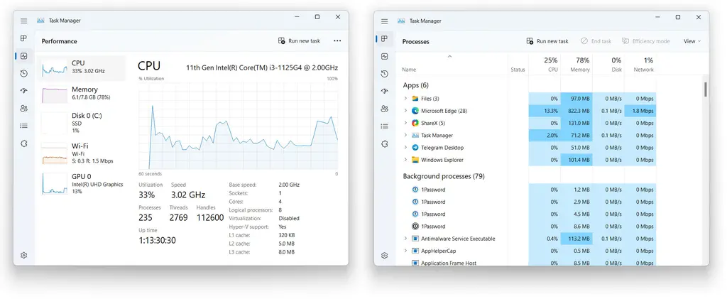
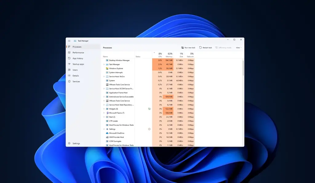
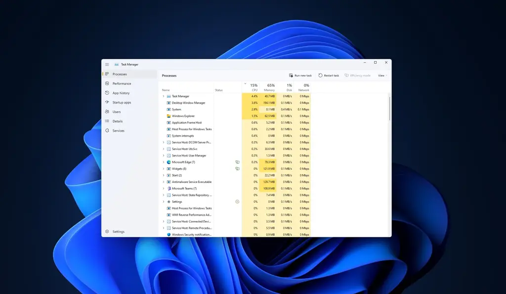
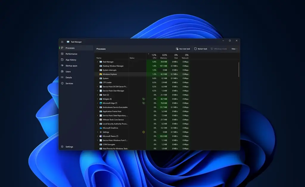
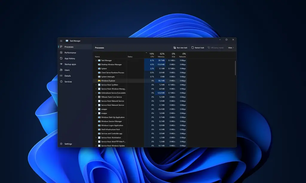
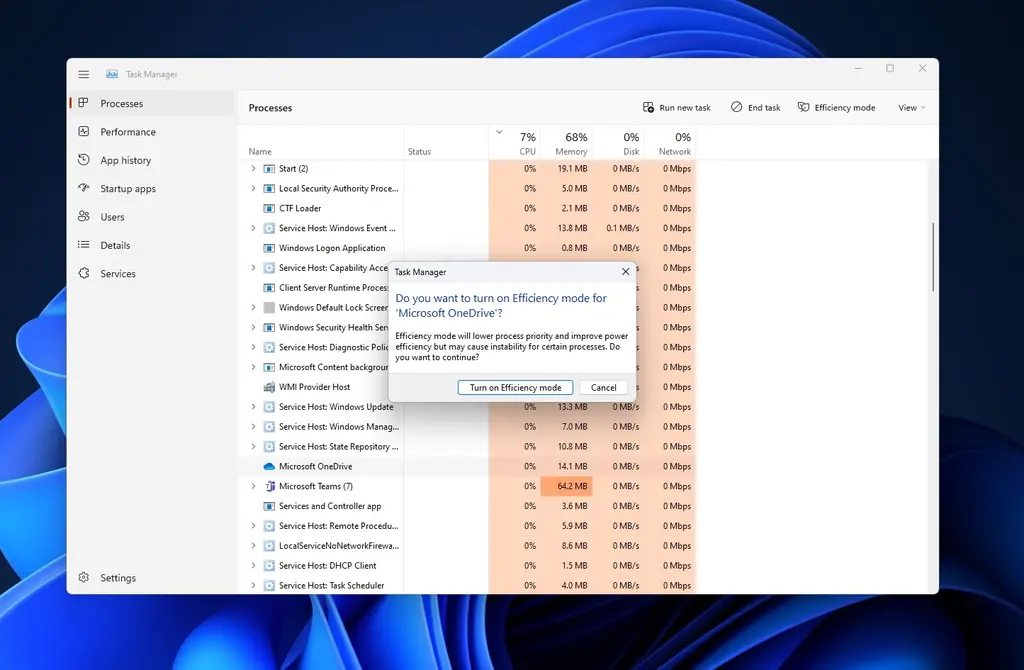
After installing windows 11 22h2, you will find that the task manager has a new design (the first visual update since 2012) and follows the UI principles of windows 11. You still can't call the task manager by right clicking on the taskbar, but the application makes up for this defect by supporting dark mode and the ability to follow the system's key colors.
When explaining the hamburger menu, Microsoft hopes that the task manager will follow the modern UI framework and windows 11 set design principles. This new interface is simple in many ways, and Microsoft hopes to follow the same principles for task manager.
It is hoped that the overall navigation experience will be consistent with that of Microsoft through the simplified menu 11. You can click on the hamburger menu and browse the page, or use Ctrl + tab to browse the page, so the new design is absolutely keyboard and barrier free.
- new task manager provides better ease of use**
The original label / some areas are now changed to common operations. Users can intuitively see various operations by clicking the page on the left. This way you can create a new task or run a task without having to open an additional menu. Because these options are displayed in the command bar.
Another obvious change is the new settings page, which can be used to switch between dark / light modes, or set the default login page. Regarding the status icon in the task manager, Microsoft said it decided to replace the pause icon with the pause icon to reduce confusion.
- the new function of task manager improves UI response speed**
In terms of functions, there is a newly added function called "efficiency mode", which will help you control CPU resources for a specific process. "When you usually play with windows, there must be a specific process or application that uses a lot of resources (CPU). In the past, we always had only one choice, that is to terminate it through the task manager," said the program administrator in charge of Microsoft's task manager.
"You can actually use efficiency mode, which can not only control your CPU resources, but also improve your UI response speed.". At present, the efficient mode of task manager can only control CPU intensive applications, but Microsoft is also exploring support for memory and network use, which may be enabled in future versions.
The new task manager looks good and the dark mode is great, but by default, tags lack tags, which can confuse even experienced users.
6. Improvements to settings and Applications
- ● improve don't disturb mode and focus**
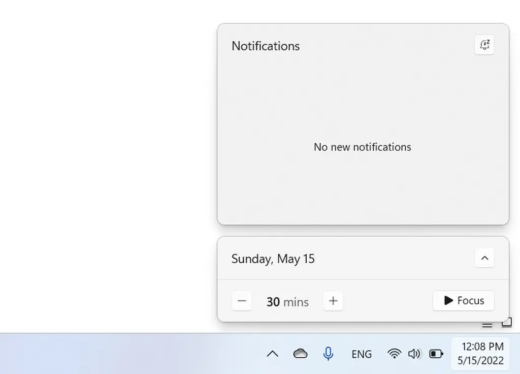
Windows 11 22h2 brings an appropriate do not disturb mode and a separate focus mode. Do not disturb (formerly focus assist) is a more traditional way to turn off incoming notifications using various rules.
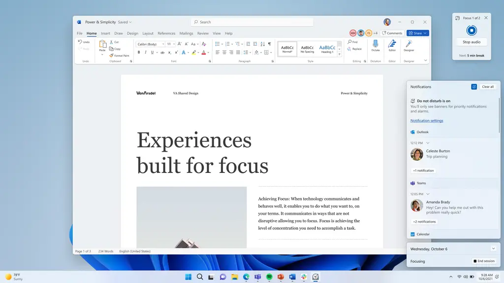
Focus is a slightly advanced feature that allows you to create timers to focus on specific tasks and improve your productivity by reducing distractions. You can start a new session by flying out of the clock app, settings app, or calendar on the taskbar. Focused meetings can automatically activate the no disturb mode, hide the notification badge, and disable icon flashing.
A more immersive focus experience includes opening the do not disturb option from the action center. The new non intrusive settings allow you to choose which notifications are displayed first when turned on, making the whole process easier.
Focus sessions is another noteworthy feature that will help you work more efficiently on windows. After you start focus sessions, windows 11 will turn on the no disturb and turn off the taskbar badge, and will start a timer to remind you to take a break between work. It integrates with clock applications and spotify.
- ● improve support for airpods**
Windows 11 can now be better used with various airpods models. The operating system is supported by broadband voice, which makes the audio quality of voice calls better.
- ● faster animation on displays with high refresh rates**
Dynamic refresh rates on supported devices with fast screens can now work in many parts of the operating system, not just office Medium or when applied. Windows 11 can be raised to 120Hz when displaying animation, scrolling and moving the cursor. This will make the operating system feel smoother and more responsive on the supported hardware.
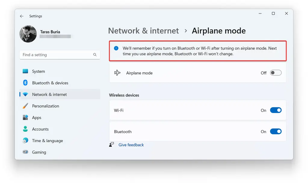
- ● improved flight mode**
Windows can remember the status of radios available in flight mode to keep them running the next time you switch modes.
7. Barrier free function
- real time subtitles at system level**
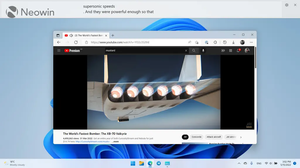
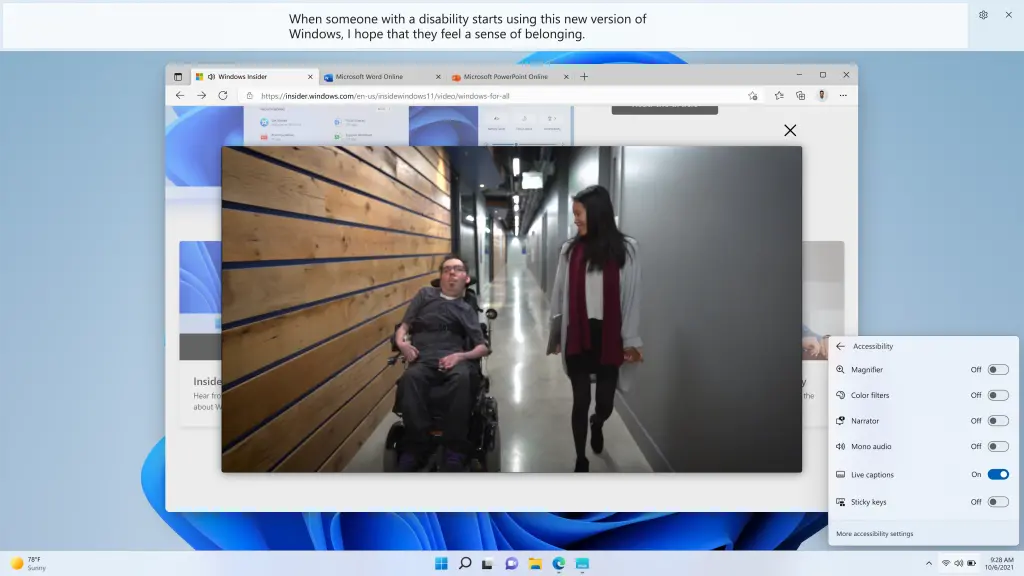
Windows 11 now integrates system level real-time subtitles. As the name suggests, windows 11 can automatically transcribe the content of any audio clip. It is worth noting that since subtitles are generated on the device, this function can work without an Internet connection. This feature is already available for windows 11 insider.
- ● enhanced voice access**
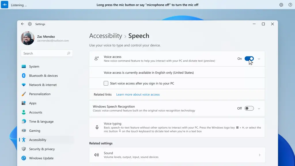
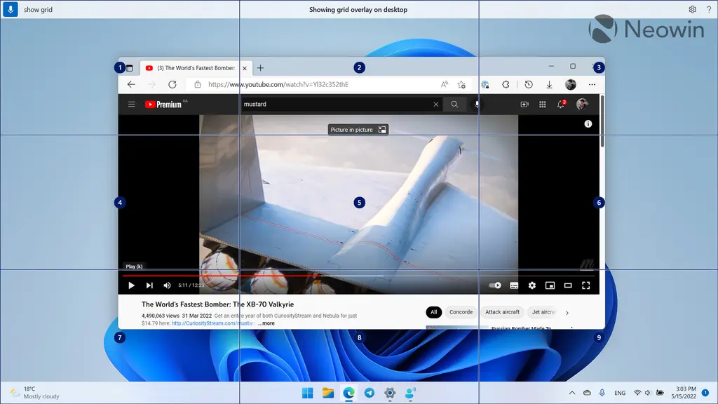
In addition, windows 11 users use voice to open and switch applications, browse web pages, read and write emails. When you first open voice access, windows 11 will prompt you to download the voice model of voice recognition on your device to help you get started. It is worth noting that voice access can support American English. This feature is already available for windows 11 insider.
Voice access includes an interactive guide that explains how to use voice to complete common tasks. When the voice interview is listening, you can also ask "what can I say?" To access the complete list of commands. Voice access even gives real-time feedback on what it hears, so that when it makes a mistake, you know which word is not recognized correctly.
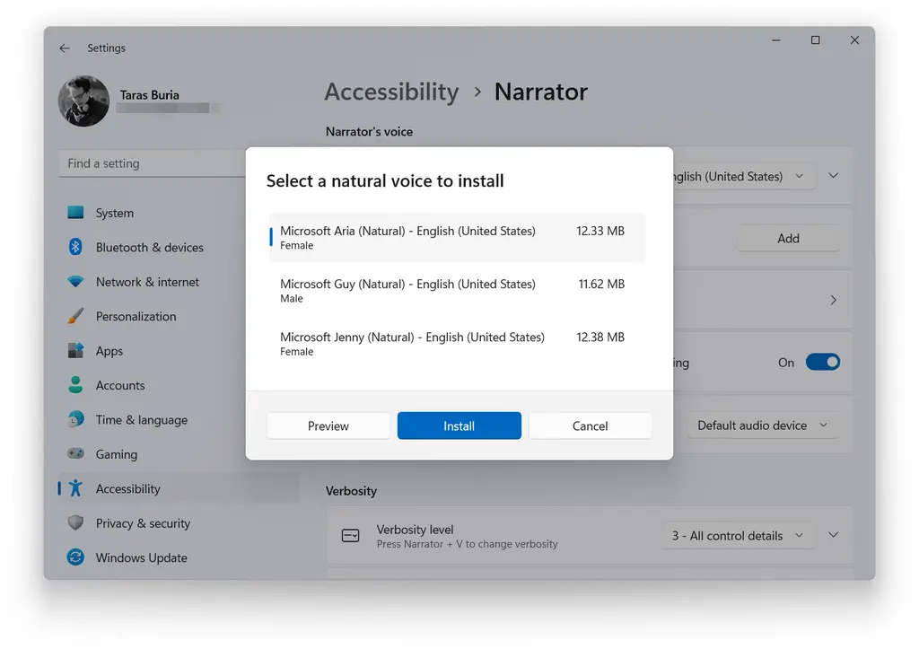
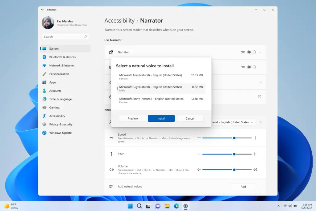
- ● add natural voice for narrator**
After hearing customers' feedback on narrator's experience, Microsoft is finally adding natural voice to narrator, so that people with visual impairment can enjoy scenes such as browsing web pages, reading and writing emails. Like voice access, narrator natural voice supports American English.
8. Some annoying places**
Windows 11 22h2 does not change the hardware requirements. You still need a relatively modern processor and a TPM chip to officially run the operating system. What changes is the initial setting process. Now, an active internet connection is a prerequisite for all SKUs. In addition, you also need to log in with a Microsoft account (you can try to use this guide to bypass this restriction).
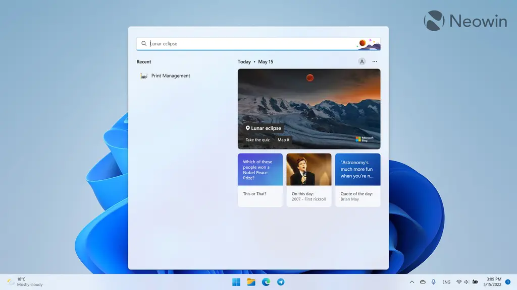
Another thing that will annoy you is updated search. It still looks chicken (try searching for "Recycle Bin"), but now there are more recommendations, or just advertisements. In addition, many of the best features are area locked.
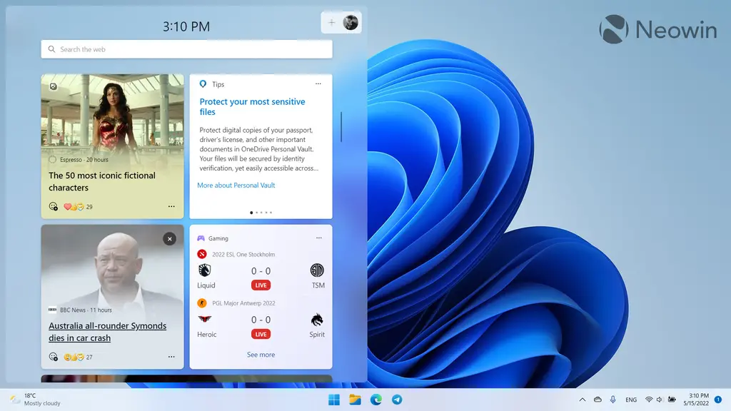
Windows 11 mixes standard widgets with various news and stories on newly installed devices, so finding the widget you need will cause you to scroll through tabloid news and other advertisements. Fortunately, Microsoft has provided a richer layout of widgets on the system upgraded from the original windows 11 version to the 22h2 version.
Summary
Finally, windows 11 22h2 feels like the operating system Microsoft should have released in the first place. Although some surfaces still need additional polishing, the 22h2 version feels significantly more mature than the original version. Many new features introduced by windows 11 are now more user-friendly and flexible.
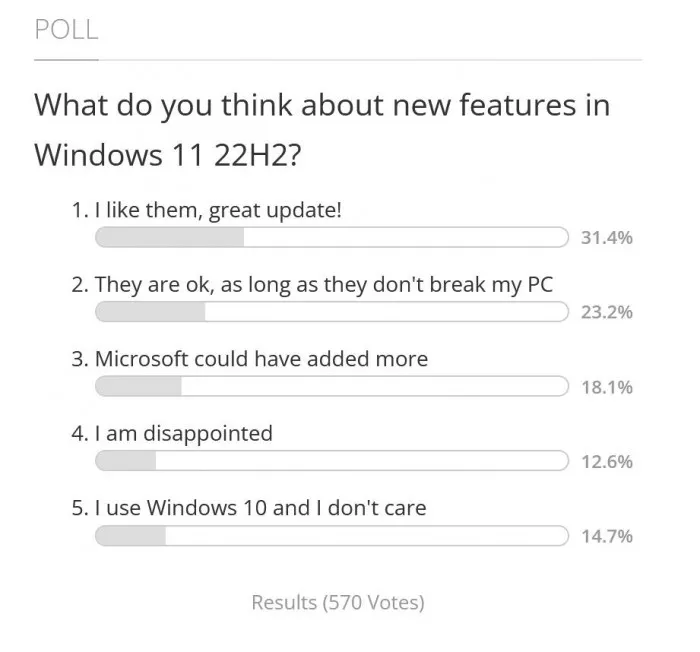
In addition to barrier free function, there is no breakthrough ability. However, many subtle changes have created a better and more pleasant operating system. Windows 11 22h2 will make those who have migrated to the latest operating system happy and give windows 10 users more confidence and courage to upgrade.

