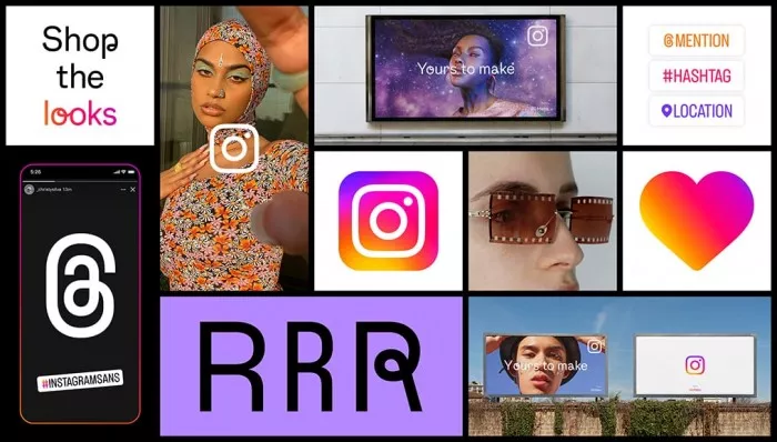
This visual update can be summarized into three basic parts, including redesigned gradients, new fonts, and new layout and design. For example, gradients use more vibrant colors and lighting to make them feel more vibrant.

"Our vibrant gradients have been redesigned using an innovative 3D modeling process to make it feel bright and vivid. Instagram gradients, composed of our brand colors, are the basis of our complete color system. Through lighting, gradients herald the moment of discovery in our marketing, logo and even in applications, as seen in creating patterns, stickers and instagram story rings." Instagram said: "we are happy to bring vitality to the instagram experience through our redesigned gradient energy."

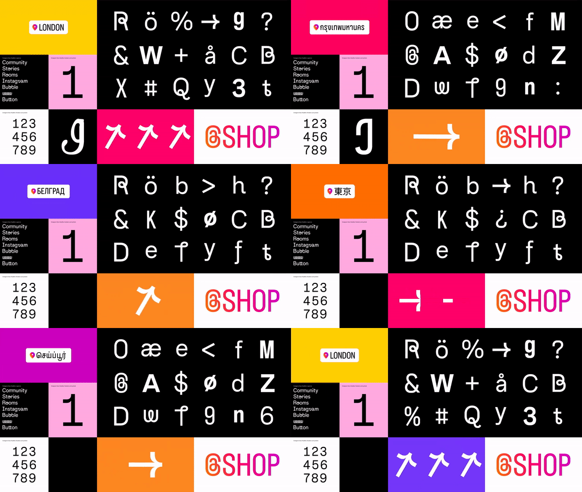
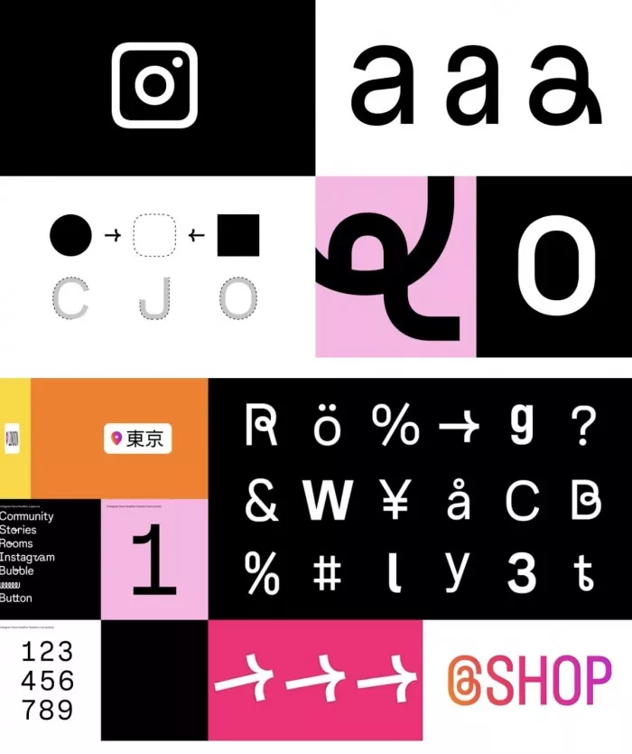
The new instagram is also equipped with an updated font called instagram sans, which will appear on the whole platform, including story and reels.

"Instagram sans is also a new way for our global community to express itself on instagram in places such as stories and reels. In designing this new font, our goal is to make instagram sans available worldwide. We work with language experts around the world to adapt the font to global texts, including Arabic, Thai and Japanese. We hope to support all our creators and community members, They promote cultural development and fully express themselves in any language they choose, "the company said.

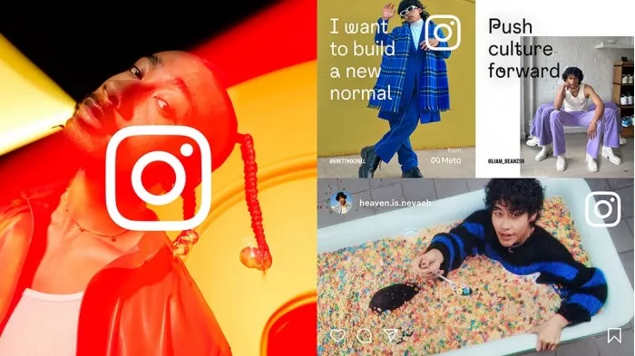
Last but not least, this design overhaul should put the content at the center of everything. The new marketing layout allows full screen images, making it much easier to find new content than before.