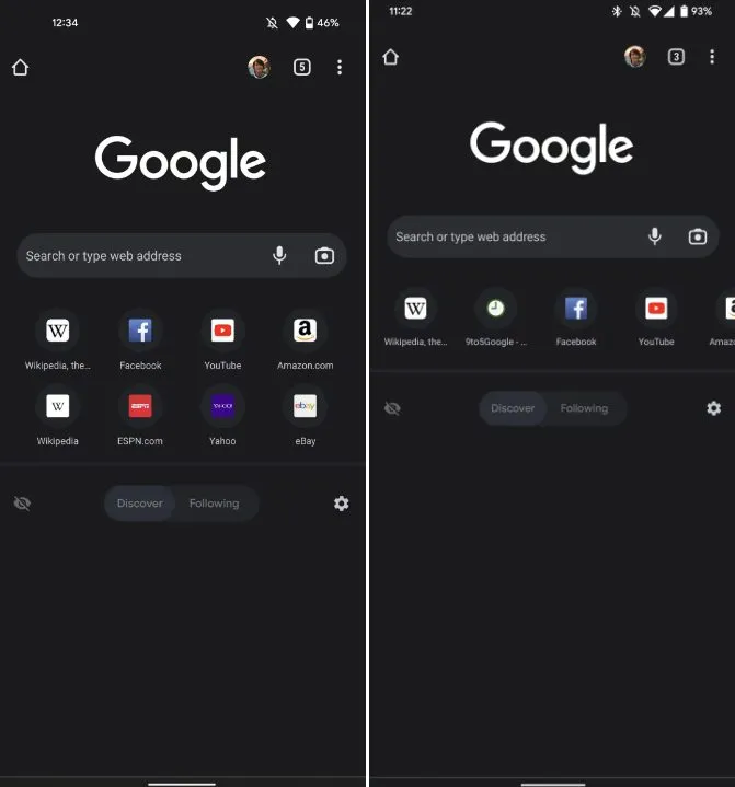
In recent days, Google has continued to maintain high productivity, and the team has made some changes to the design of its products. Recently, it has made many changes in Google play, including adding the compatibility section, removing the "movies and TV" tab, and more. Now, it is testing the new design of the new tab of chrome Android, which will × The favicon grid of 2 becomes a scrollable turntable.

It is reported that as 9to5google discovered, the new design changes were tested on some users over the weekend. Under this new design, the new chrome page on Android will appear in a more tidy layout, because the grid of eight shortcut icons that currently consume space will only be a long row of turntables. If the browser's "discover" and "follow" functions are turned off, it will give you a cleaner bottom new tab. If you choose to activate it, you will naturally get a more spacious feed, which can scroll on it.
According to FT, this is the only function seen in this test, and it is still in the current 4 × 2 where the grid is located. In other words, chromeandroid users will still see the omnibox address bar with voice and image search icons, the find / follow feed section, and other details of chrome at present.

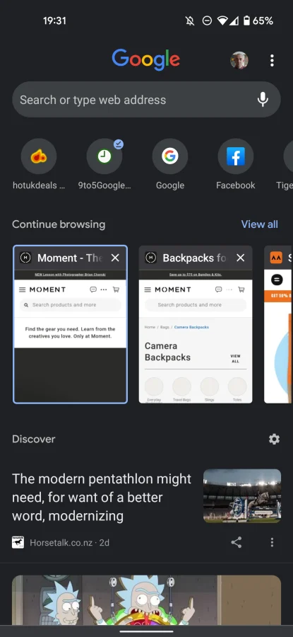
It can be recalled that in April this year, Google tried the same navicon scrollable turntable in chromeoandroid system, and added a new "continue browsing" section. It is placed directly above the discover feed section of the tag and uses a turntable effect with the option to call up the view all option. This test has not been widely tested and has not been implemented on users around the world.