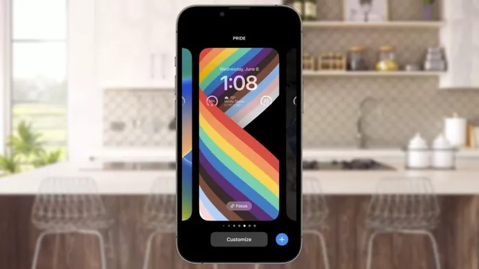
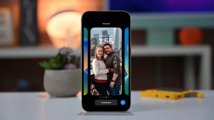
Craig federighi, senior vice president of Apple software engineering, said that Apple's overhaul of the IOS 16 lock screen was a "love action" aimed at making the iPhone more personalized. Apple introduced an updated lock screen in IOS 16, providing users with a way to personalize their iPhone in addition to selecting wallpaper. After WWDC, Craig federighi and Alan dye, vice president of Apple design, discussed the development of lock screen changes.

"We know this is a multi act play, and we feel that the next thing we need to improve is the lock screen," federighi told techradar. "We see a real opportunity to take advantage of this field that has developed slowly over time but has never seen such great progress to do some real big things -- but it is also very Apple And very personal things. "
Federighi rated it as "an 'action of love' this year".
Dye explained, "our goal is to make iphone More personalised -- and certainly more useful -- but keep the key elements that make the iPhone the iPhone intact. "
He went on to say that the goal of the design team is to "create some content that is almost more flexible, so that users can create a lock screen that will eventually look like a great magazine cover or movie poster, but in a way that hopes to be really simple, very interesting, and even a lot of automation."
Part of the appearance of the magazine is to make the elements intersect with other elements, for example, to make the main body of the wallpaper appear in front of the clock. Dividing these elements has been the goal of the team for many years, but we have to wait until it is perfect, because "unless the Division is heinous, it will destroy the aesthetics".

Machine learning is also used to determine how to adjust the lock screen image to a perfect state. Federighi said that "there are more than a dozen neural networks that judge the photos according to whether it is an ideal theme. If there are people there, they will determine how to view and cut in the photos, and their expressions. All these things enable us to automatically emerge the choices of really great and eye-catching people, and then present them on the screen in a way that makes them feel almost new."
This information is used to provide users with an alternative look, not a specific filter. According to dye, if the system thinks the picture doesn't look good, it won't provide it to the user, but choose a more appropriate method to implement it.
Federighi added: "what you get is much more eye-catching than just putting a filter on the picture."
Dye added that the introduction of more items on the lock screen was inspired by the complex features of the apple watch to make them as clear as possible. "No doubt -- one of the benefits of having a design team responsible for the design of each product and all our products is that we have learned a lot about the information that can be glimpsed and how to depict it on a variety of different images."
With regard to the changes of notifications, dye put forward the idea that they flow from the bottom of the screen, which is very good for personalization. "Because we often see that notifications completely cover the photos on your lock screen, we don't want to do this in this new design."
With the upgrade of the new IOS version, additional personalization options may confuse some users, but federighi believes that it will be accepted by the public. If users do not want to, apple does not intend to force them to make major changes to the lock screen, and this is an option, you can participate or not.