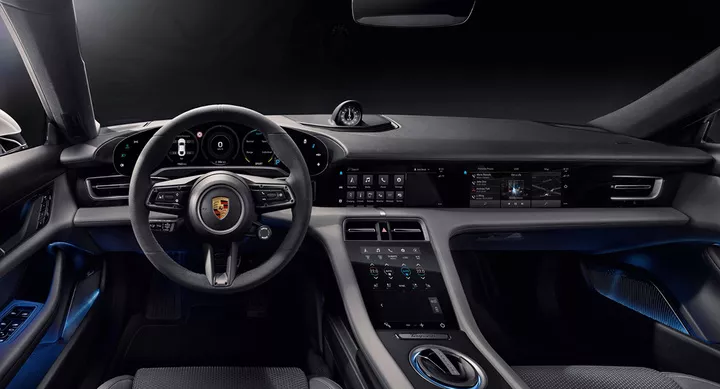
In March 2014, Apple renamed 'iOS in the Car', which was introduced at WWDC nine months earlier, to CarPlay and announced that the in-car service would be officially on board within the year.
Three months later, the first CarPlay-enabled model rolled off the assembly line in Maranello, Italy - and it was none other than Ferrari that fired the first shot for Apple.
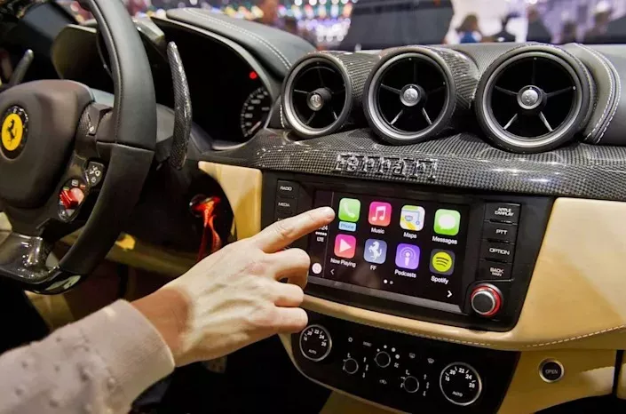
▲Image from: yahoo
The Ferrari FF, which costs $5.3 million, sets a very high bar for CarPlay, but Apple clearly doesn't want CarPlay to be a plaything for the few. That same year, Honda and Hyundai joined the fray with CarPlay-enabled models.
As we all know, CarPlay is sweeping the passenger car market at a breakneck pace. As for the reasons why, come on, take a look at BMW iDrive and Audi MMI from the same era.
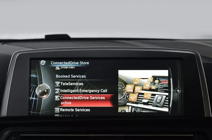
▲BMW iDrive
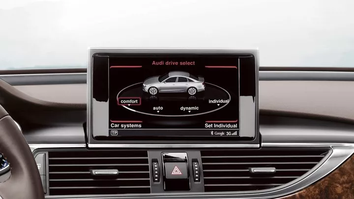
▲Audi MMI
Now eight years later, Apple proudly stated at WWDC earlier this month that CarPlay is available in 98 percent of cars in the U.S. and that 79 percent of U.S. consumers say they will only buy CarPlay-enabled models.
The success of CarPlay not only lies in Apple's strong software and huge user base, but also in the fact that it provides users with the best interactive experience of its time, kicking the center screen into a new era.
Where does a good interactive experience come from? A great car system is naturally a must, and on the other hand, it comes from the screen that puts the car in front of the driver.
A big screen is not a good thing
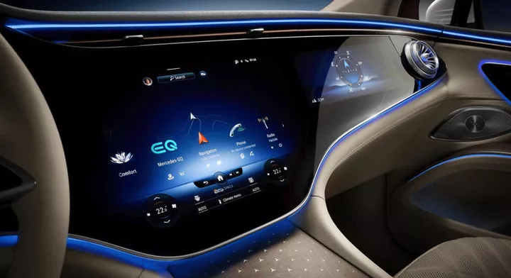
By 2022, almost all car manufacturers are emphasizing intelligence and connectivity, stuffing their 'smart cockpits' with one big screen after another and chopping physical buttons again and again to create a so-called futuristic and technological sense.
The screens are getting bigger and bigger, and their number is increasing, but the question is, has the experience really gotten better?
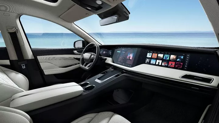
In March this year, the Car Club visited the Chinese design center of an international car company to participate in a discussion on interior design. The most popular suggestion from the media was to "add more physical buttons" for no other reason than the fact that integrating a bunch of physical buttons into the screen would be very detrimental to driving safety.
The American Automobile Association conducted a study with the University of Utah on center screens, which showed that operating a center screen while a car is in motion is a very risky behavior for drivers, and the safety risk is even more pronounced for older drivers, who typically complete a task six seconds slower than younger people.
The biggest problem with the touch screen is that the driver can't accurately locate the button position.
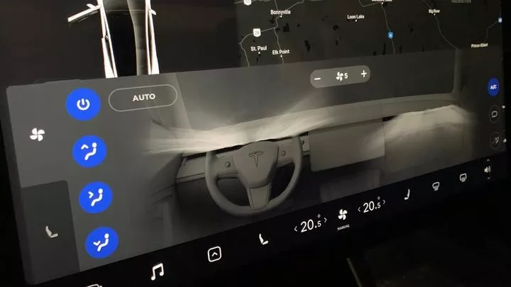
An associate professor of mechanical and industrial engineering at the University of Utah said that with a touch screen, the driver always has to look down at the screen, whereas with a physical button, the driver will be able to know exactly where the button or knob is once he or she is familiar with it and will not have to look down when operating it.
After the user has formed a habit or the manufacturer has optimized the operation logic through OTA, the problem of inconvenient operation can be alleviated, but the security problem hidden behind the scenes is something that no amount of OTA can completely solve.
According to the World Health Organization, about 1.3 million people die in traffic accidents each year, and distracted driving is one of the main causes.
A study by the Federal Motor Carrier Safety Administration also showed that close to 80 percent of crashes across the United States involved a distracted driver who was not focused on driving in the first three seconds of the accident.
So, until mature autonomous driving arrives, drivers should still focus on the road. With the technology available, competing the number and size of screens is not a good thing.
With screens, we should all exercise restraint
In fact, a similar view has already been expressed by automakers.
Polestar Polaris designer Conny Blommé said during an interior design workshop in May this year.
The large screen may cause the driver to be unable to focus on the road, which could lead to an accident.
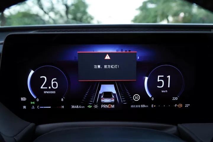
The size and quantity of the screen should be closely integrated with the positioning of the model and the car scenario, and deeply bound to the functions of the car.
Manufacturers who want to give put one, or even multiple, larger screens in their cars should improve driving safety by providing more easy-to-read, useful information, such as traffic lights that are about to turn red, accident alerts, road conditions ahead, etc., without interfering with the driver's vision.
Also, the usual physical buttons for the driver should be reserved for air conditioning temperature, air volume, air outlet mode, defogging, emergency lights, hazard warning flashers, volume control, etc.
Ideally, automakers and UX (user experience) designers must incorporate the guideline of "no interference with the driver" throughout the product design process to ensure that the screens and their controls are not designed to interfere with the driver's ability to drive safely.
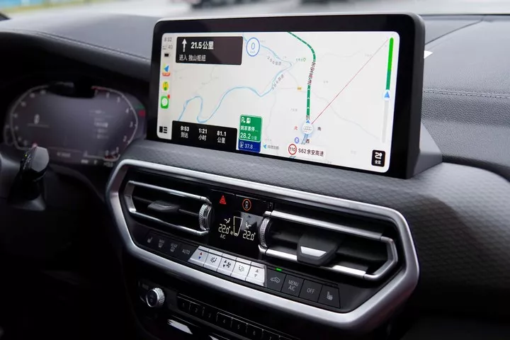
Transport Canada had introduced a Guidance on Limiting Distractions Caused by Visual Displays in Vehicles, which states that "the time taken to complete a task (on a vehicle machine) should be less than 12 seconds."
Car manufacturers should put more thought into getting drivers off the screen rather than strapping a bunch of screens in front of them.
In the same interior design seminar, Matthias Junghanns, chief interior designer of the BMW i series, also expressed his opinion that large screen design will be abandoned by car companies.
Smart technology in all vehicles should be at your fingertips, but the control interface will only be there when it is needed, or when you want it to be.
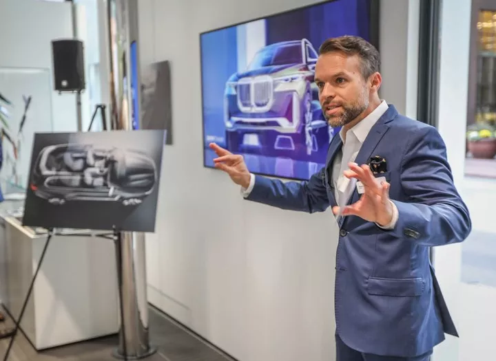
▲Matthias Junghanns
Not only should car manufacturers exercise restraint regarding the use of screens, we, as consumers, should exercise the same restraint.
While it can't be ruled out that some UX designers are indeed 'interacting with their feet', I believe that most designers are still smart - and they know that it's easier to use knobs to adjust the temperature and buttons to cut songs.
In fact, car manufacturers are in a tough spot. On the one hand, they are under constant regulatory pressure for safety, and on the other hand, there are a number of consumers who are demanding entertainment features for their cars.
It's a tricky question - after all, how can you say no to the consumer? The market doesn't want it?
How to properly guide consumers is one thing that both automakers and your media colleagues should think about, but it can't be done overnight.
Until then, what the automakers must do is stop the monstrous 'arms race' that is based on screen size and number.