We've heard a lot about the changes to the winui interface on Windows 11 and how it will eventually revolutionize many aspects of the user experience of existing operating systems. Some recruitment information shows that winui will bring some new development projects and transformation and upgrading of existing parts of Windows user experience.
Last year, windows The major redesign of officially kicked off. The plan is to bring winui elements to the oldest legacy of windows. As part of the redesign, Microsoft first updated the traditional context menu, using fillet or even dark mode.
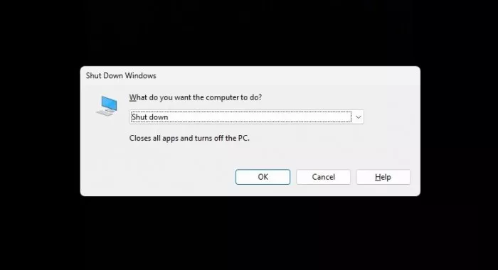
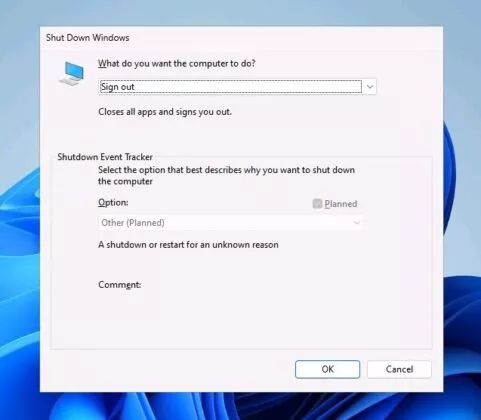
In Windows 11 build 25115, Microsoft is now exploring a more modern interface for the famous Alt + F4 dialog box. This revision abandoned the traditional windows logo and adopted a simple appearance, similar to the dialog box in the windows 95 era.
For those who don't know, the current shutdown dialog interface is the same as our interface on Windows 10. It has a new windows 11 logo and rounded edges, but it does not support "modern" winui design.

New shutdown interface
It seems that Microsoft is preparing to add more winui elements to the shutdown dialog box of the operating system, such as mica. Now, mica is only applicable to the title bar of Windows applications, and fluent design is missing. From the diagram, these changes are not very large, but they lay the foundation for future improvement, and they are necessary for design consistency.

In addition to the shutdown dialog box, Microsoft is also testing the winui and fluent design icons of winre (Windows recovery environment).

The winre interface in the Windows 8 era existing in the operating system now has new icons and may have more changes, because remember that windows 11 build 25115 is still the early working version of the main version next year. Similarly, this is not a big change, but the change of the long-standing legacy part of the operating system may lead to a more consistent design of the whole platform.
In the initial release of windows 11, the control panel has also been improved with UI, including rounded corners and new icons, which can be said to be a good start, but we still hope that one day the company can completely abandon traditional areas such as the control panel without causing difficulties to users.
It is worth noting that Microsoft is exploring the design adjustments in the windows 11 development channel, and there is no guarantee that these changes will ship with the 23h2 version.